
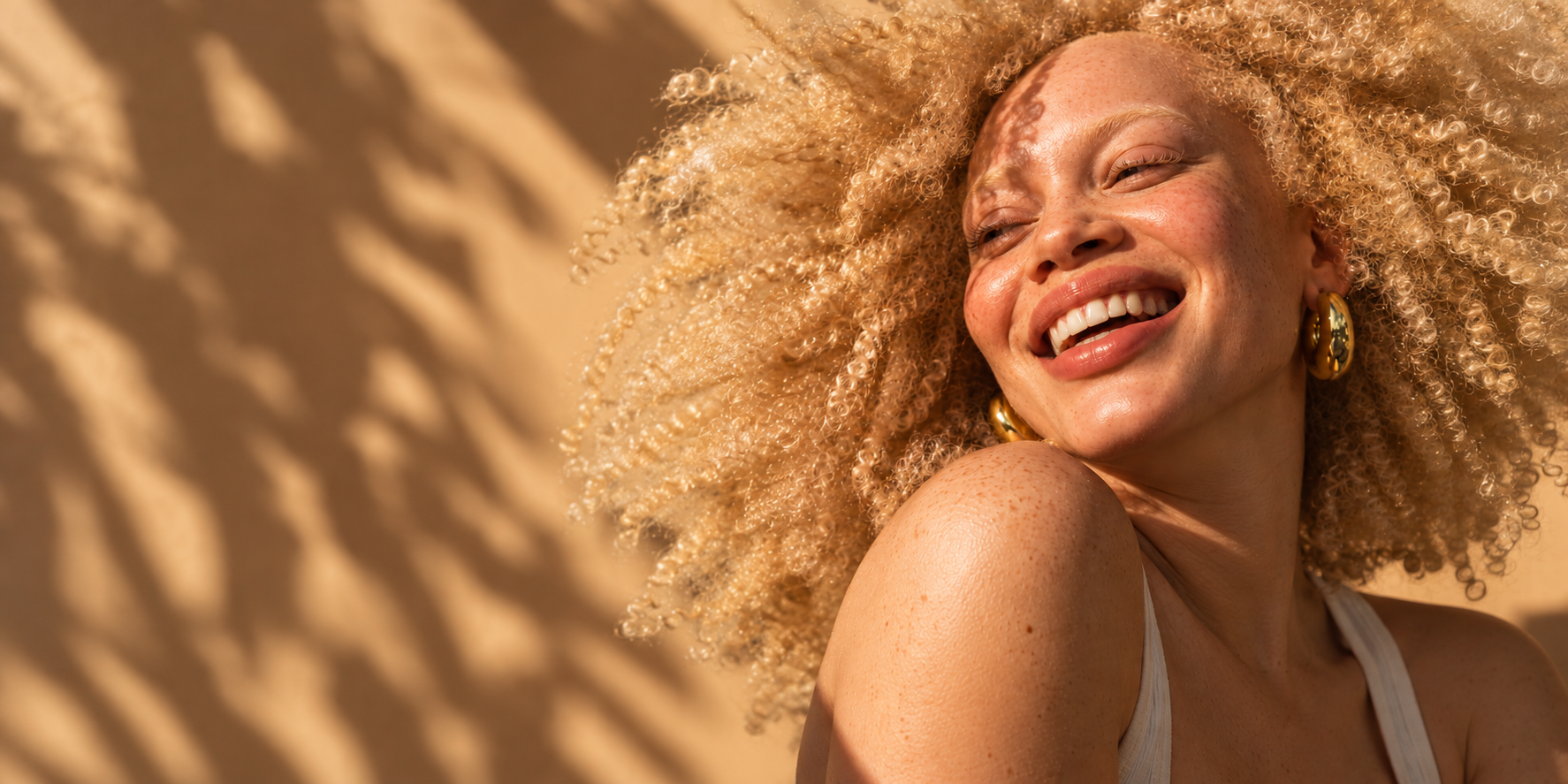
A bold, expressive haircare identity celebrating natural texture, individuality and the freedom to wear your hair however you like.
Wild Thing
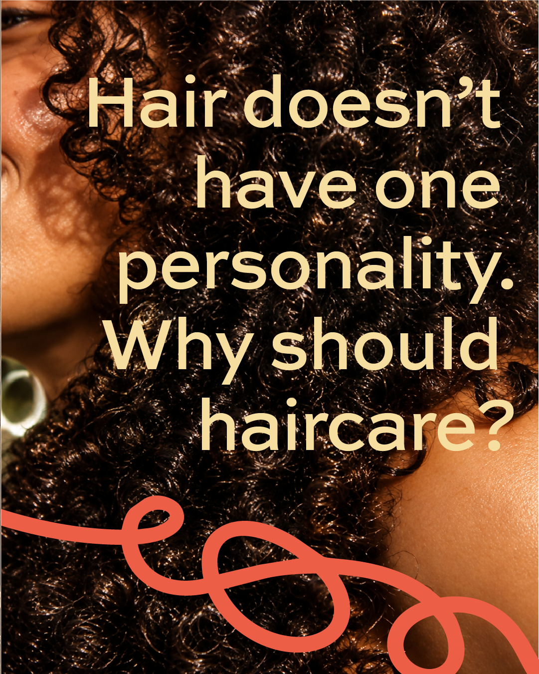
BRAND IDENTITY / HAIRCARE & BEAUTYBrand Identity | ART DIRECTION | PACKAGING DESIGN | PRINT DESIGN | SOCIAL MEDIA DESIGN | CAMPAIGN DESIGN | 2026Hair doesn't have one personality. Why should haircare?
WILD THING is a self-initiated haircare brand concept created to challenge the conventions of the haircare category.
So much of the industry is built around controlling, taming and perfecting hair. WILD THING takes a different approach, celebrating the unpredictability, individuality and versatility of textured hair.
The challenge was to create a distinctive, contemporary brand identity that could speak to people across different hair types, textures and styles without losing its personality or becoming another generic beauty brand.
The result needed to feel confident, inclusive and unapologetically expressive, with a visual identity flexible enough to work across packaging, advertising, digital and retail.
01 / THE BRIEF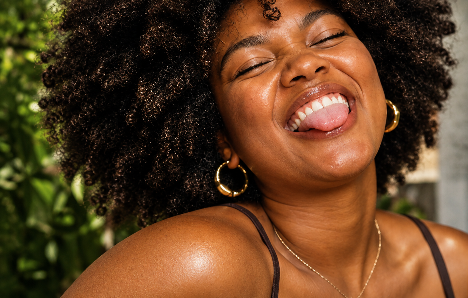
Your hair. Your rules.
Hair changes from day to day. Sometimes it's curly, sometimes it's braided, sometimes it's slicked back. WILD THING embraces that versatility rather than suggesting there's one right way to wear it.
This idea became the foundation for a visual and verbal identity built around freedom of expression.
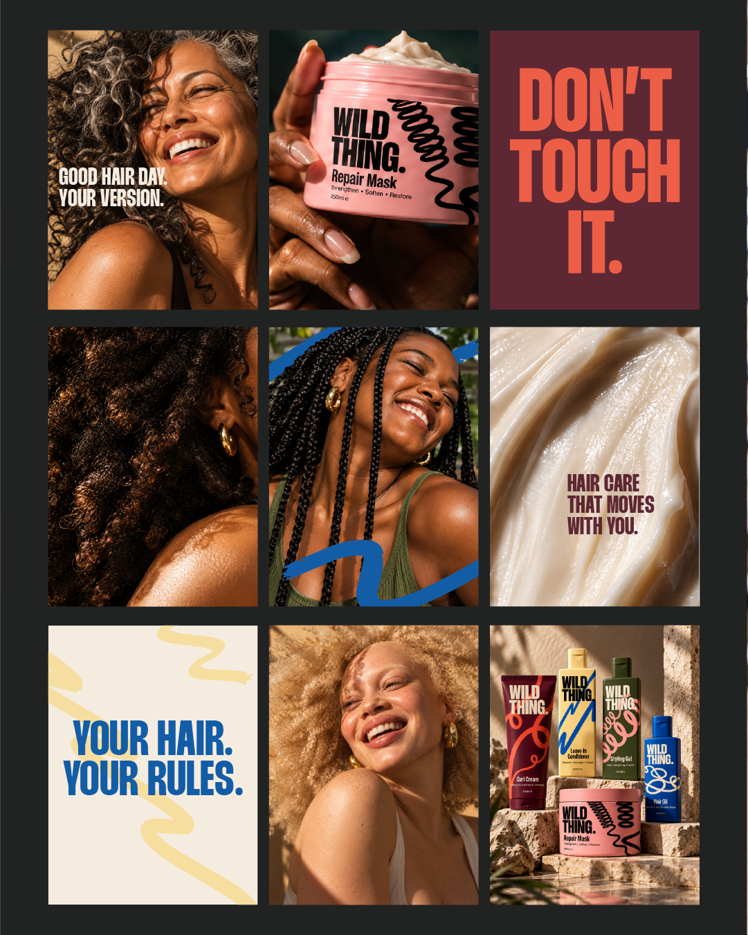
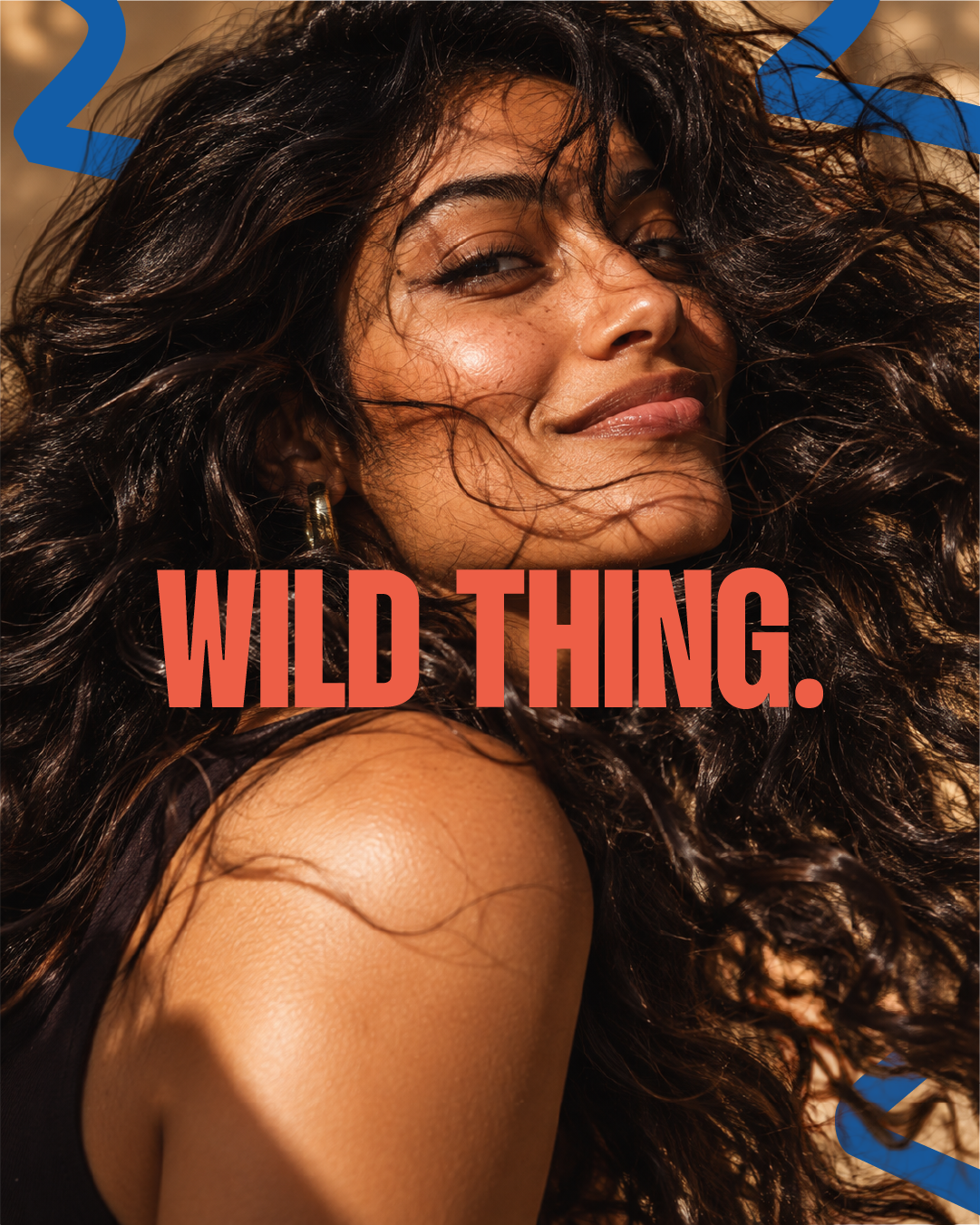
Bold typography, unexpected colour combinations, expressive graphics and personality-led photography create a brand that feels energetic, playful and unapologetically itself.
The tone of voice is equally direct, confident and occasionally cheeky.
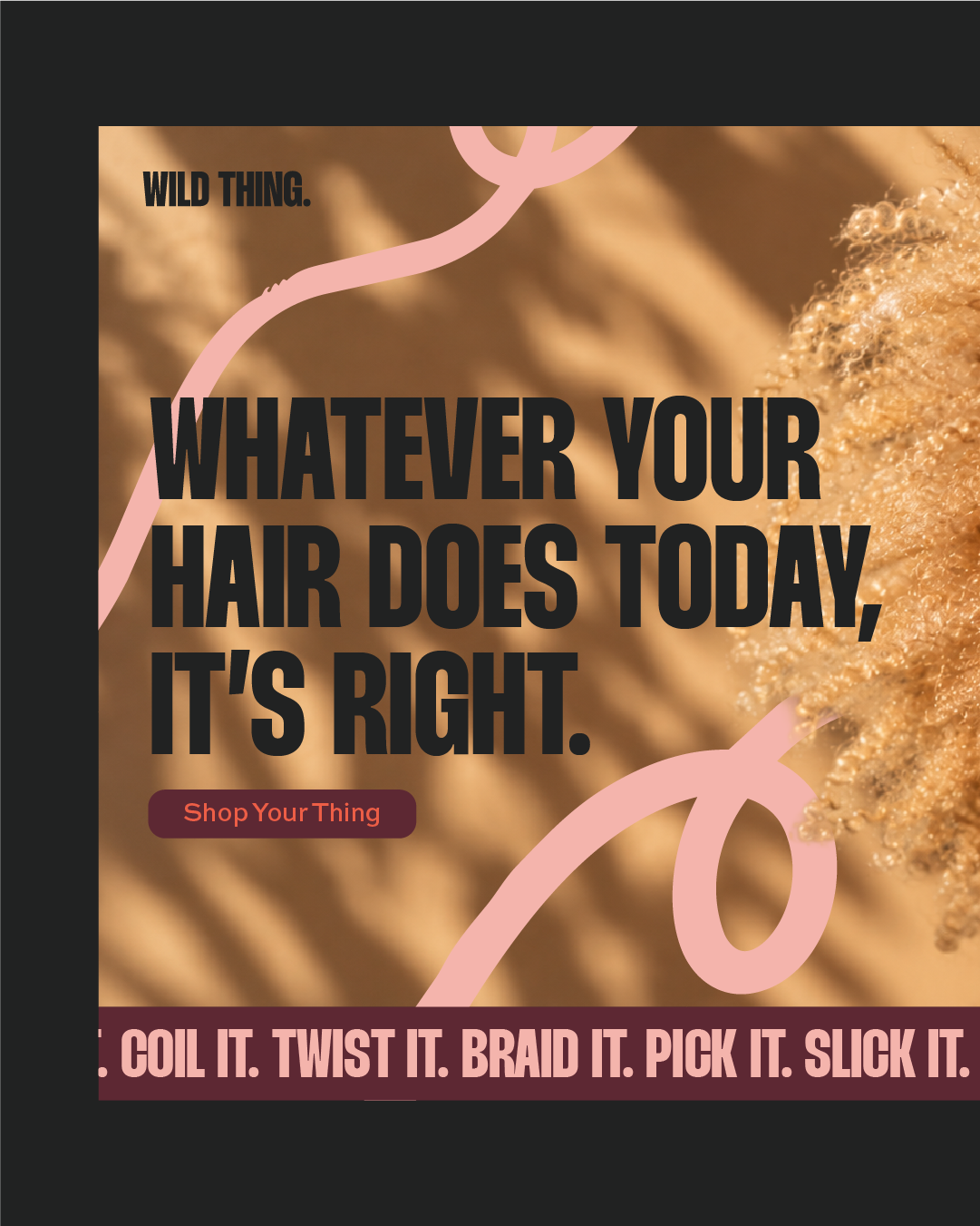
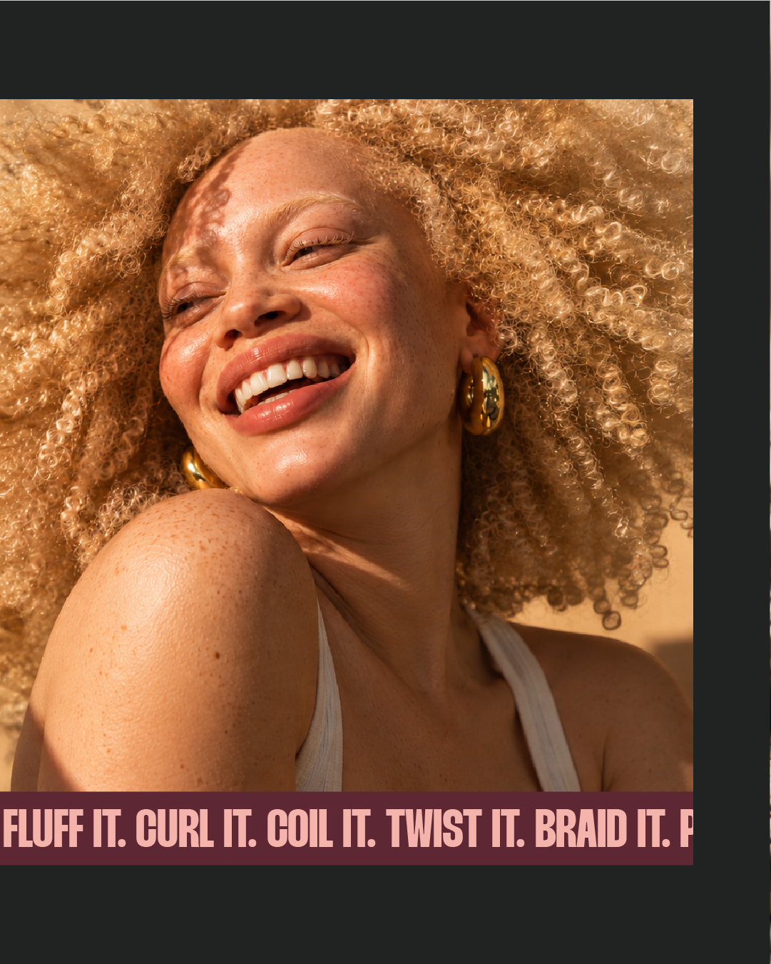
Curl it. Coil it. Twist it. Braid it. Pick it. Slick it. Fluff it.
02 / THE CREATIVE THINKING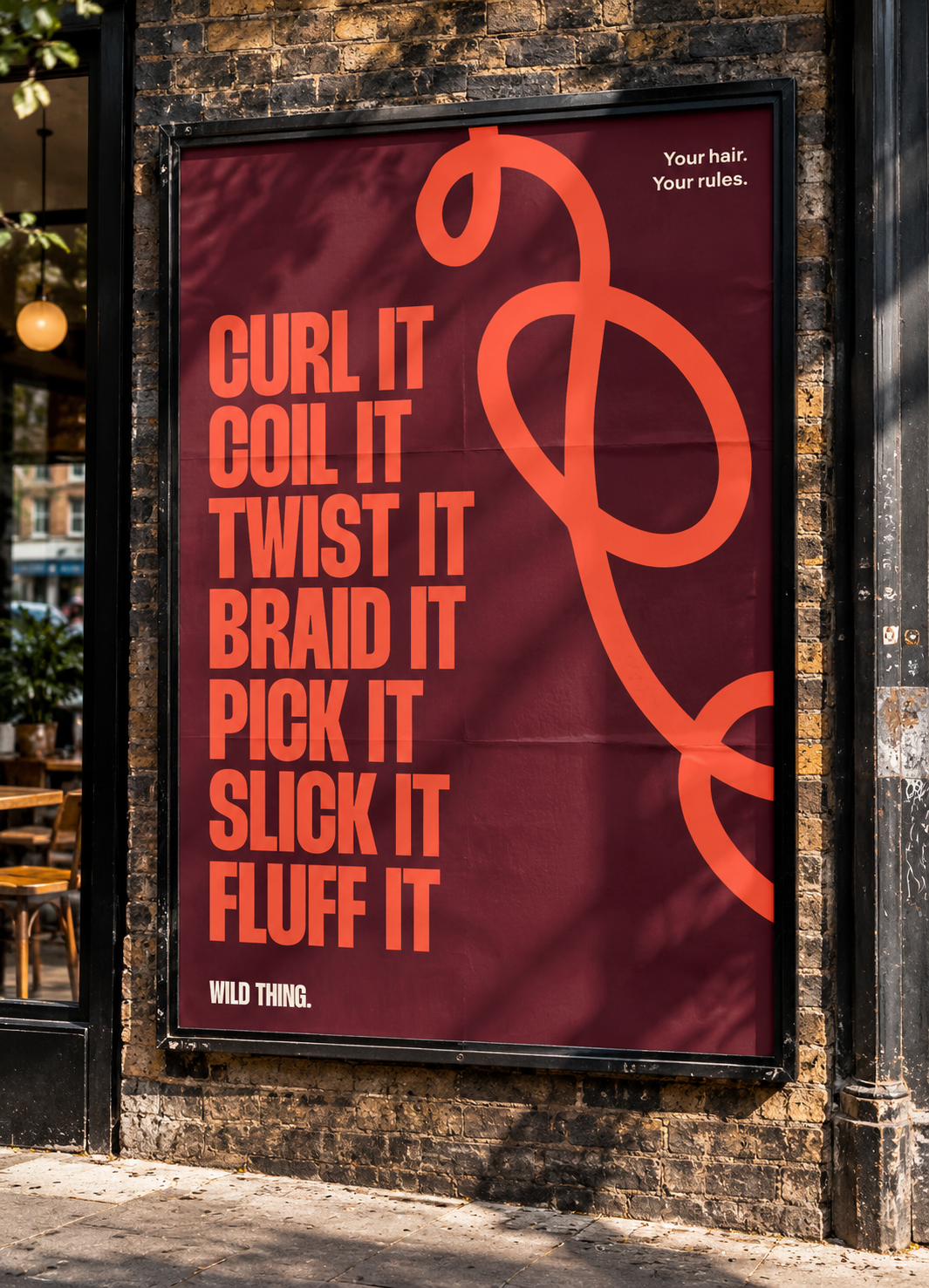
The identity centres on Thunder Bold LC, a powerful condensed typeface that gives WILD THING its unmistakable presence.
Contrasting with this strong typographic structure is a series of expressive, looping lines inspired by the movement and variation of waves, curls, coils and braids. These graphics weave through typography, imagery and packaging, creating a distinctive visual signature.
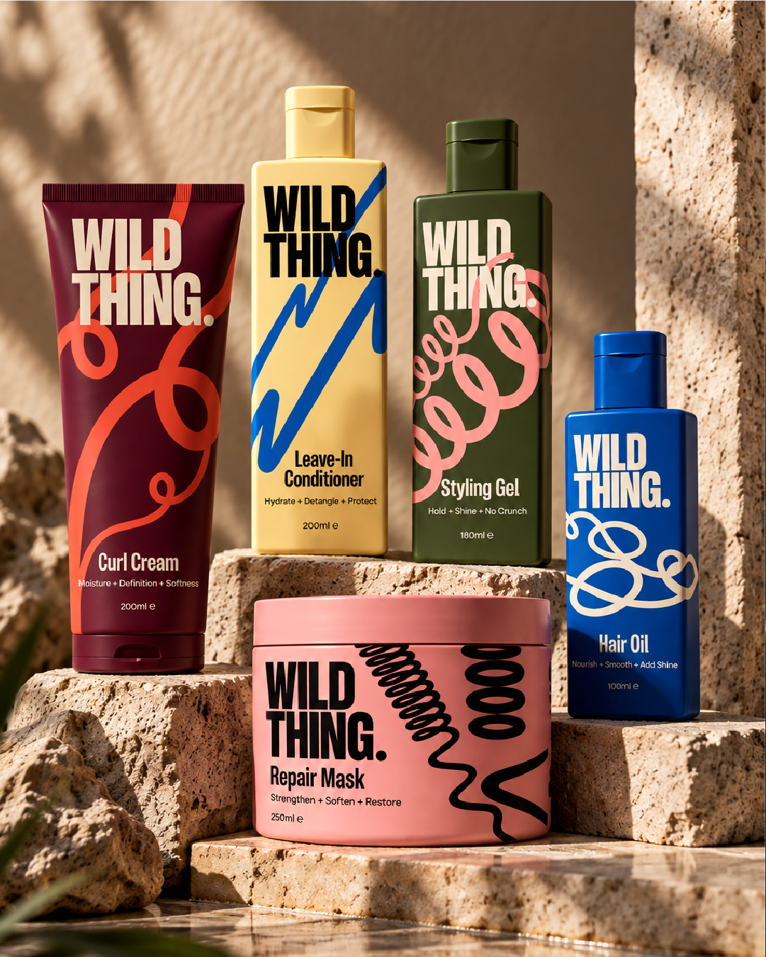
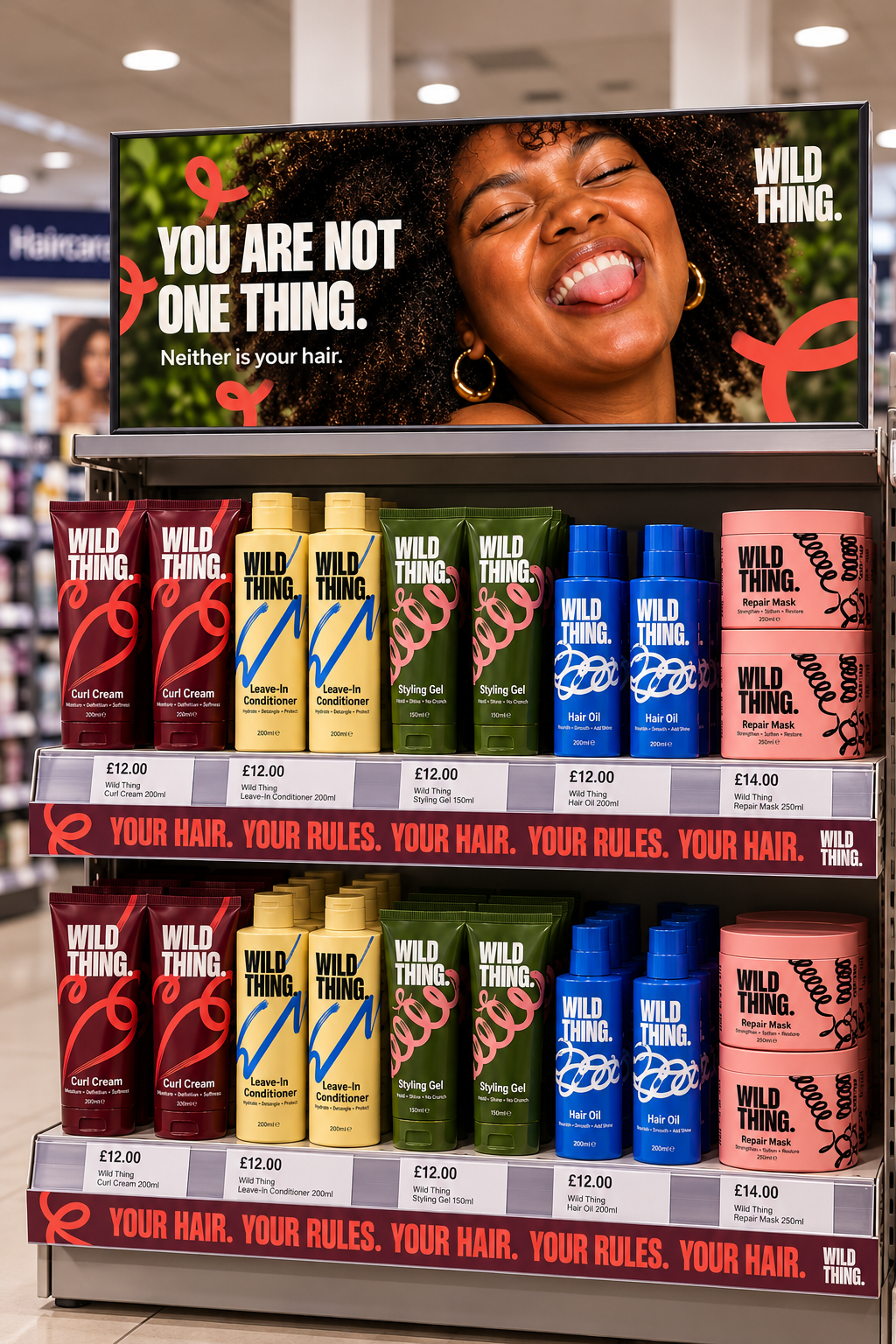
An unconventional palette of burgundy, coral, cobalt blue, olive green, butter yellow and pink brings energy and individuality to the range.
Each of the five products has its own colour combination and personality, while consistent typography, layout and graphic elements hold the family together.
The result is a packaging system designed to stand out on shelf without sacrificing cohesion.
03 / THE IDENTITY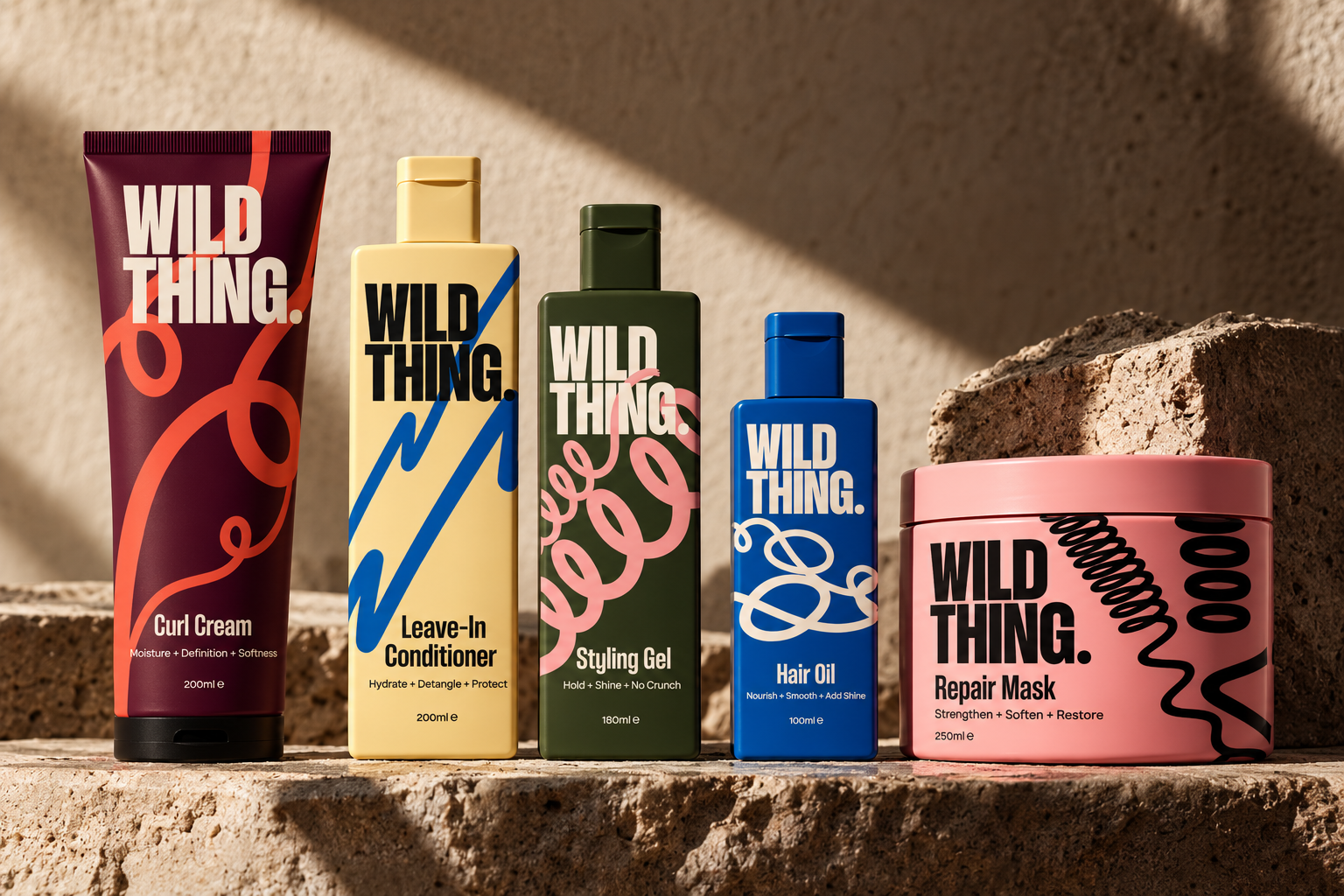
The identity was extended across packaging, advertising, social media, retail and digital applications, demonstrating how the visual system could adapt without losing its character.
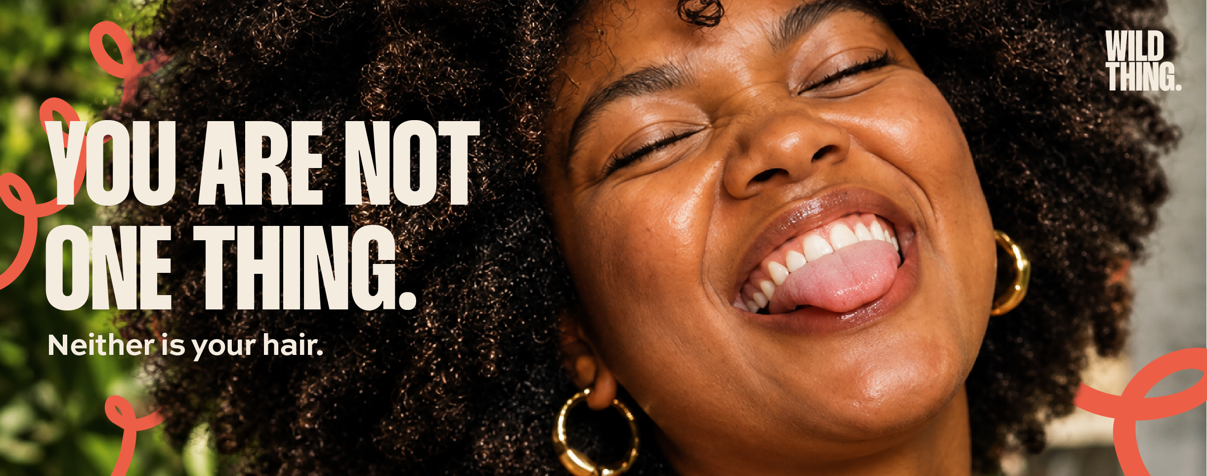
Editorial photography celebrates a diverse range of hair textures, styles and identities, favouring natural skin texture, spontaneous expressions and movement over conventional polished beauty imagery.
Oversized typography and expressive linework bring the same energy to campaign posters and social content, while branded retail displays and a website concept demonstrate how WILD THING could translate into a commercial environment.
AI-assisted image generation was used to visualise selected applications, working from original packaging designs, campaign artwork and detailed creative direction to create realistic product and retail mockups.
04 / THE BRAND IN PRACTICE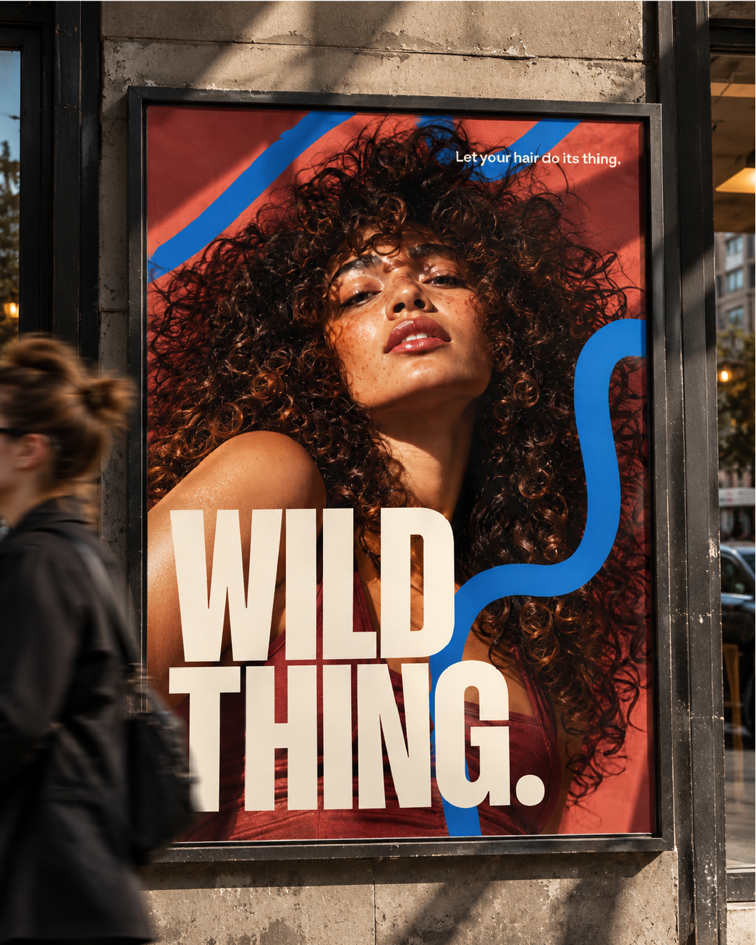
The result is a distinctive, cohesive brand world that challenges conventional haircare messaging and celebrates individuality rather than conformity.
From its bold packaging to its expressive campaign imagery, every touchpoint reinforces the same idea: hair doesn't need fixing to be worth celebrating.
05 / THE OUTCOME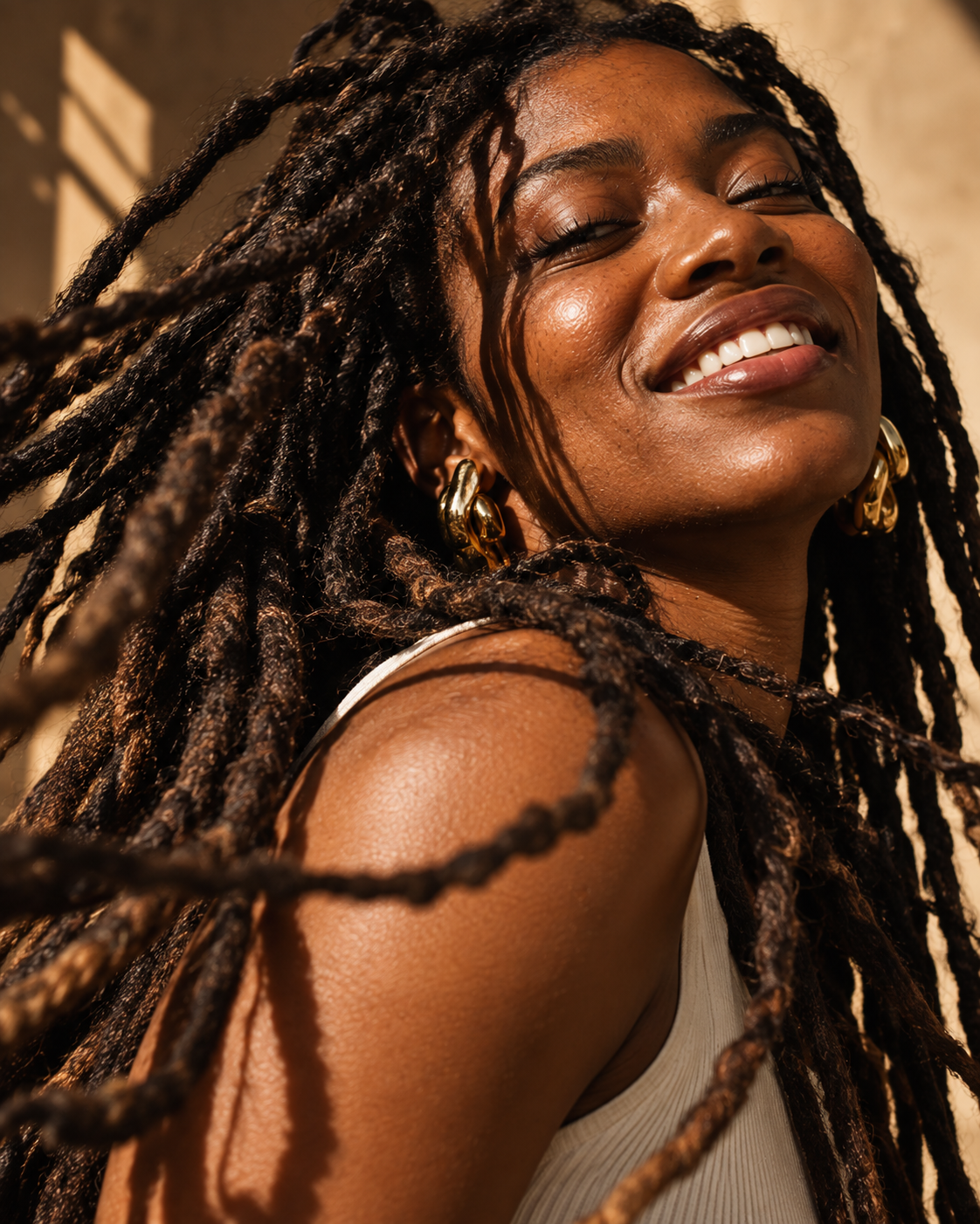
LET'S WORK TOGETHERYour brand could be next.
Got a project in mind? Whether you're starting from scratch, refreshing what you've got or looking for a little design support, I'd love to hear about it.