
BRAND IDENTITY / FOOD & HOSPITALITYSammy’s
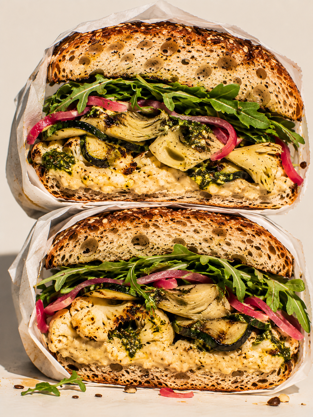
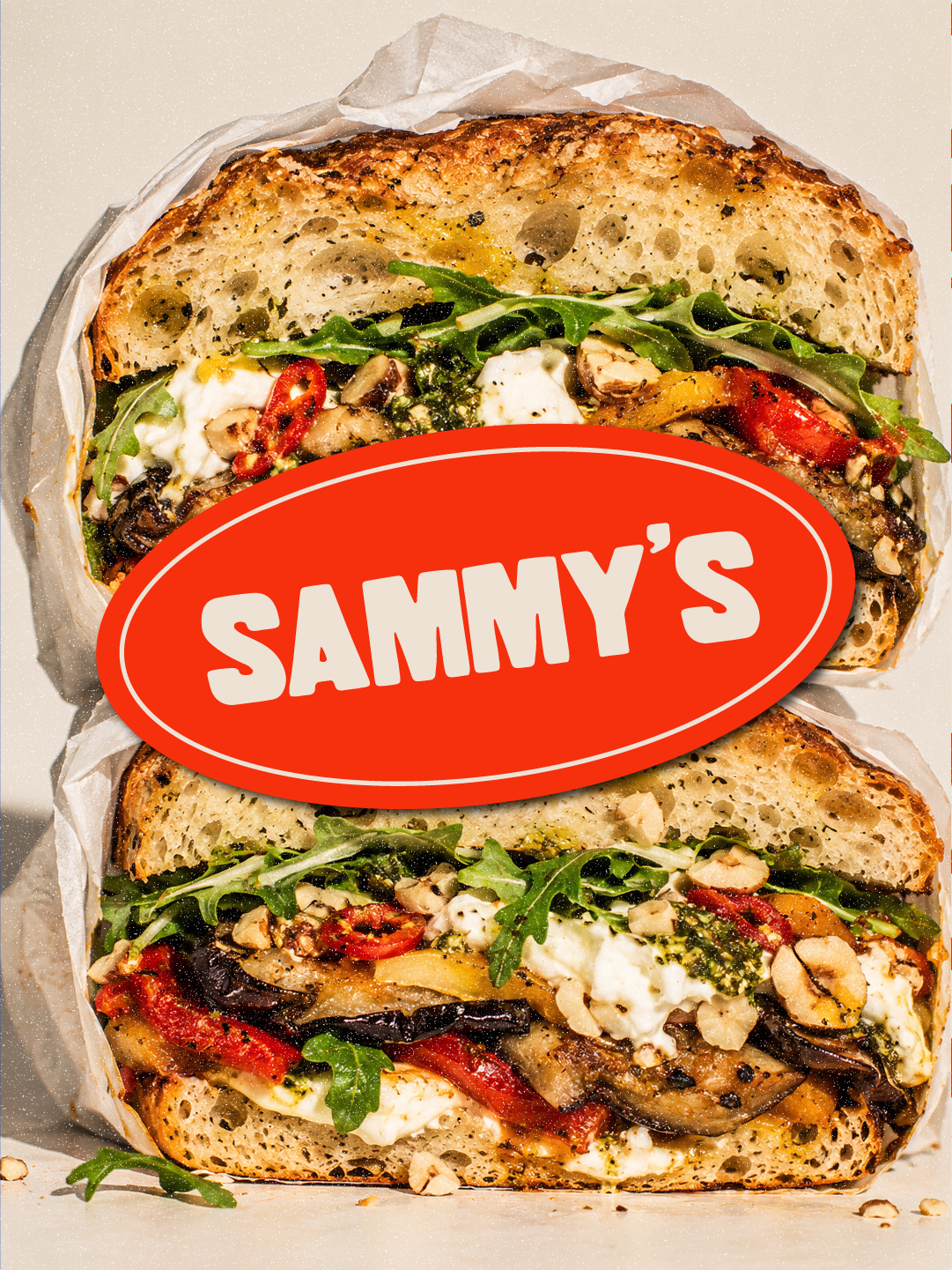
A bold, playful identity for a neighbourhood sandwich shop where generous portions, big flavours and plenty of personality are always on the menu.
Brand Identity | ART DIRECTION | PACKAGING DESIGN | PRINT DESIGN | SOCIAL MEDIA DESIGN | CAMPAIGN DESIGN | 2026Sammy's is a fictional neighbourhood sandwich shop, developed as a self-initiated creative project.
The idea was to create a brand that felt like an established local favourite, serving generously stacked sandwiches made with quality ingredients.
The challenge was to balance old-school charm with a fresh attitude. Something familiar but not dated, playful without feeling gimmicky, and confident without losing that welcoming neighbourhood feel.
01 / THE BRIEF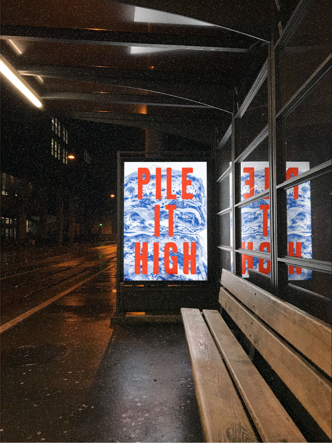
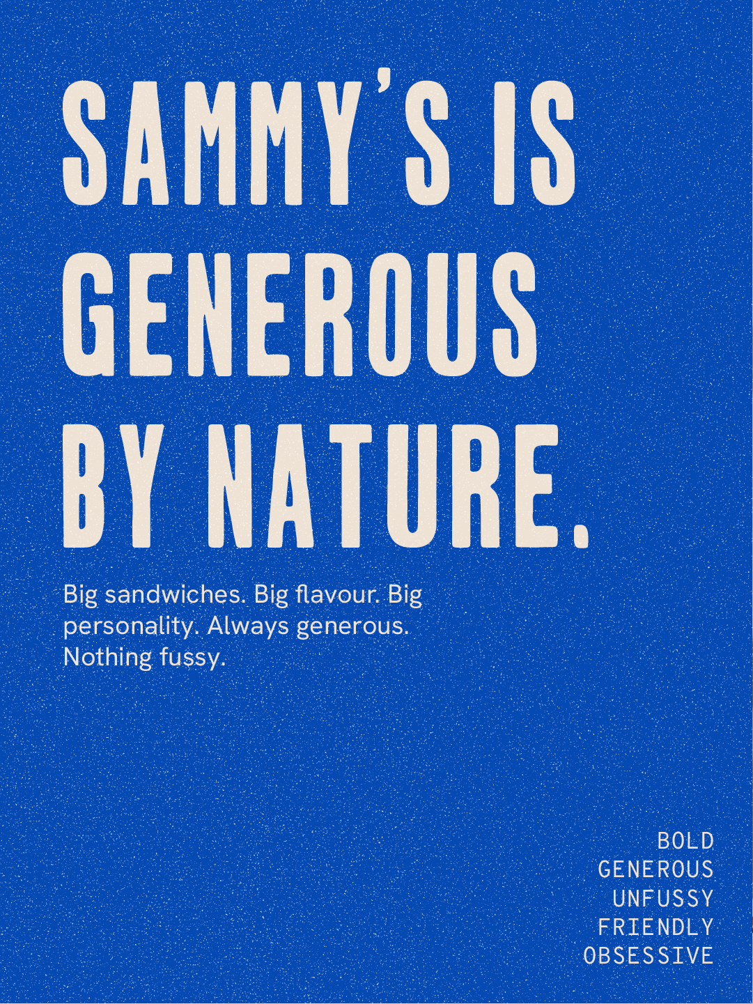
The identity was built around one central idea: Generous by Nature.
Generosity wasn't just about the sandwiches. It extended to the brand's personality, typography, colour and the way it occupied space.
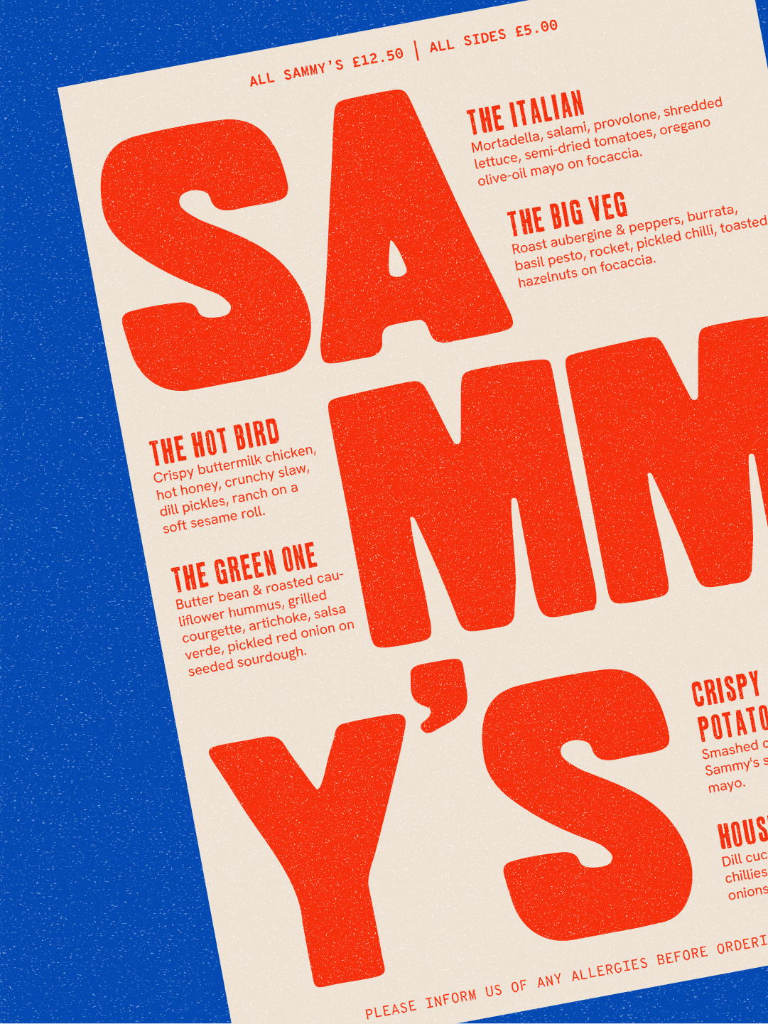
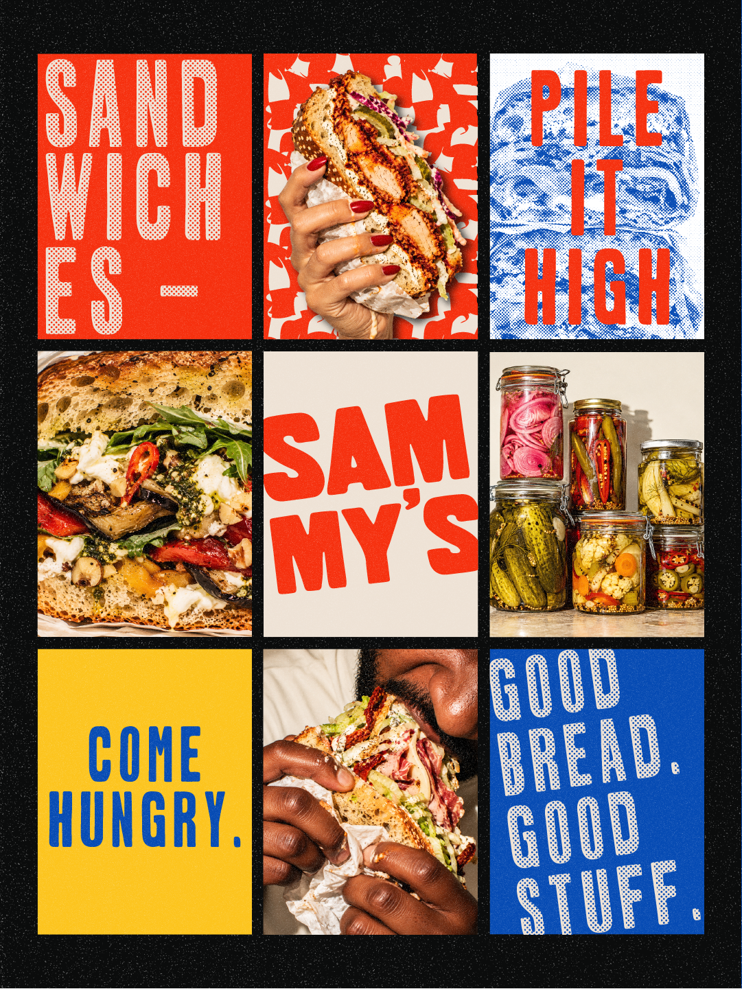
Oversized lettering, stacked compositions and bold graphic elements reflected that sense of abundance, while familiar signage and tactile print textures brought in a little old-school character.
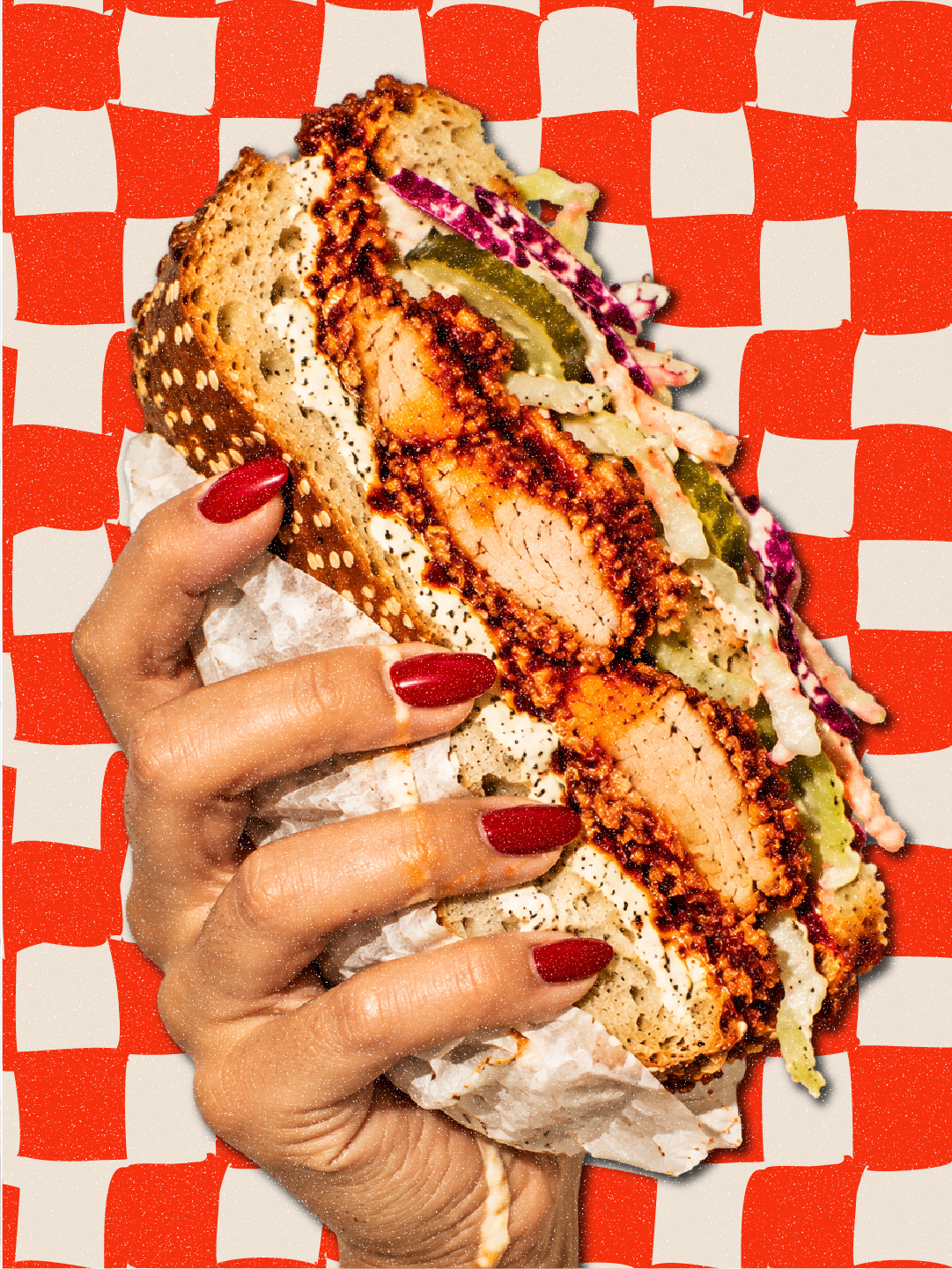
Throughout, the food remained the hero. The identity needed to have personality without competing with the sandwiches themselves.
02 / THE CREATIVE THINKING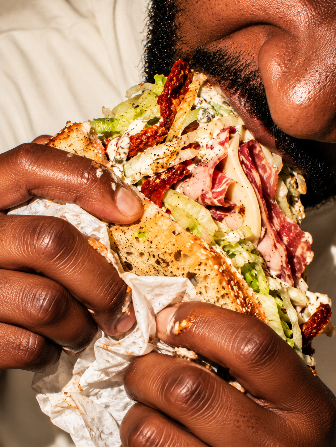
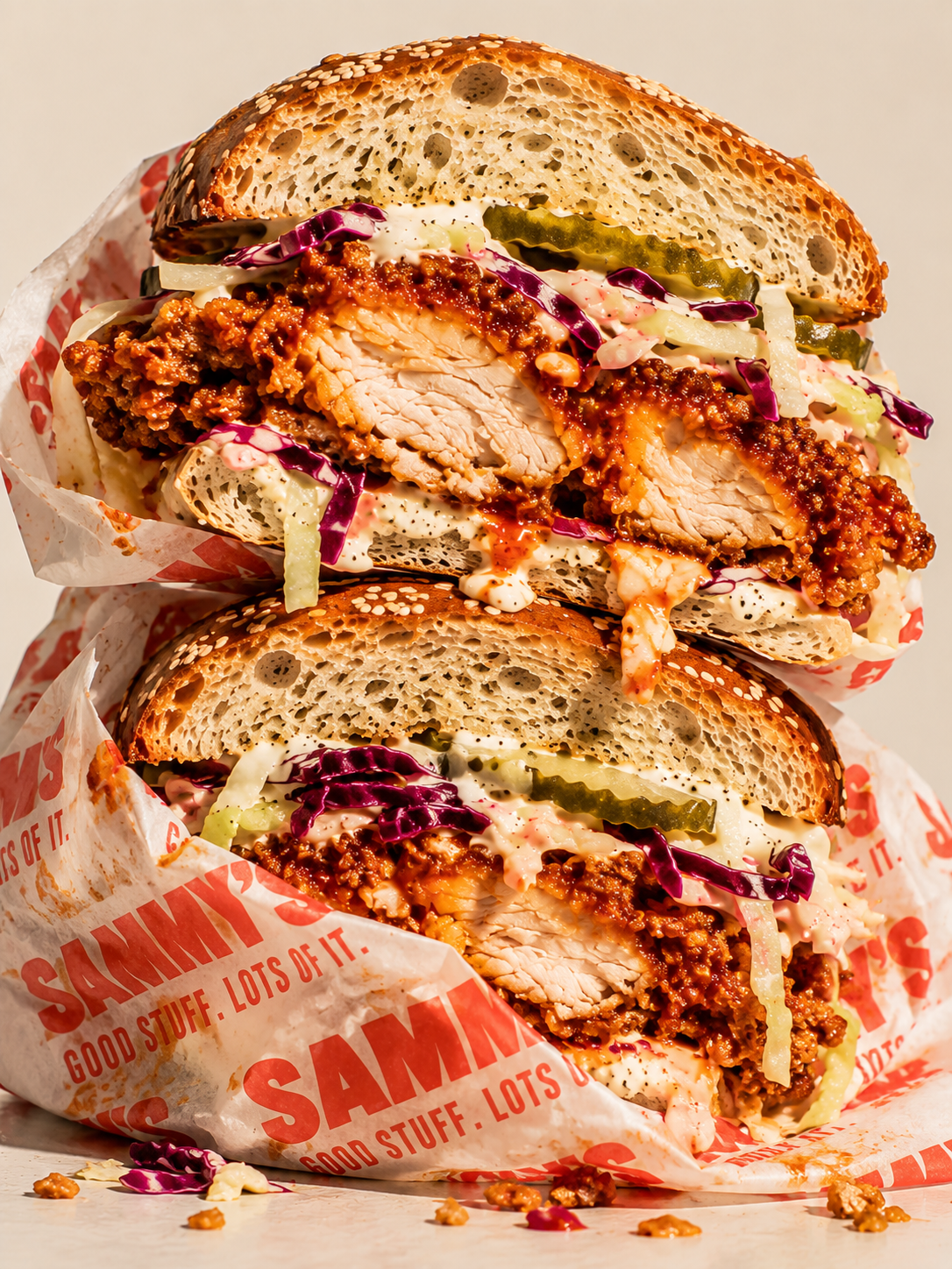
A chunky, characterful wordmark gives Sammy's its friendly, confident personality, supported by contrasting typography that balances expressive headlines with practical everyday information.
Warm cream and vivid red establish a familiar foundation, while cobalt blue and touches of yellow bring a fresher, more contemporary energy.
Oversized type, bold colour blocking, halftones and subtle print imperfections create a flexible graphic language that feels playful and substantial without becoming overly decorative.
03 / THE IDENTITY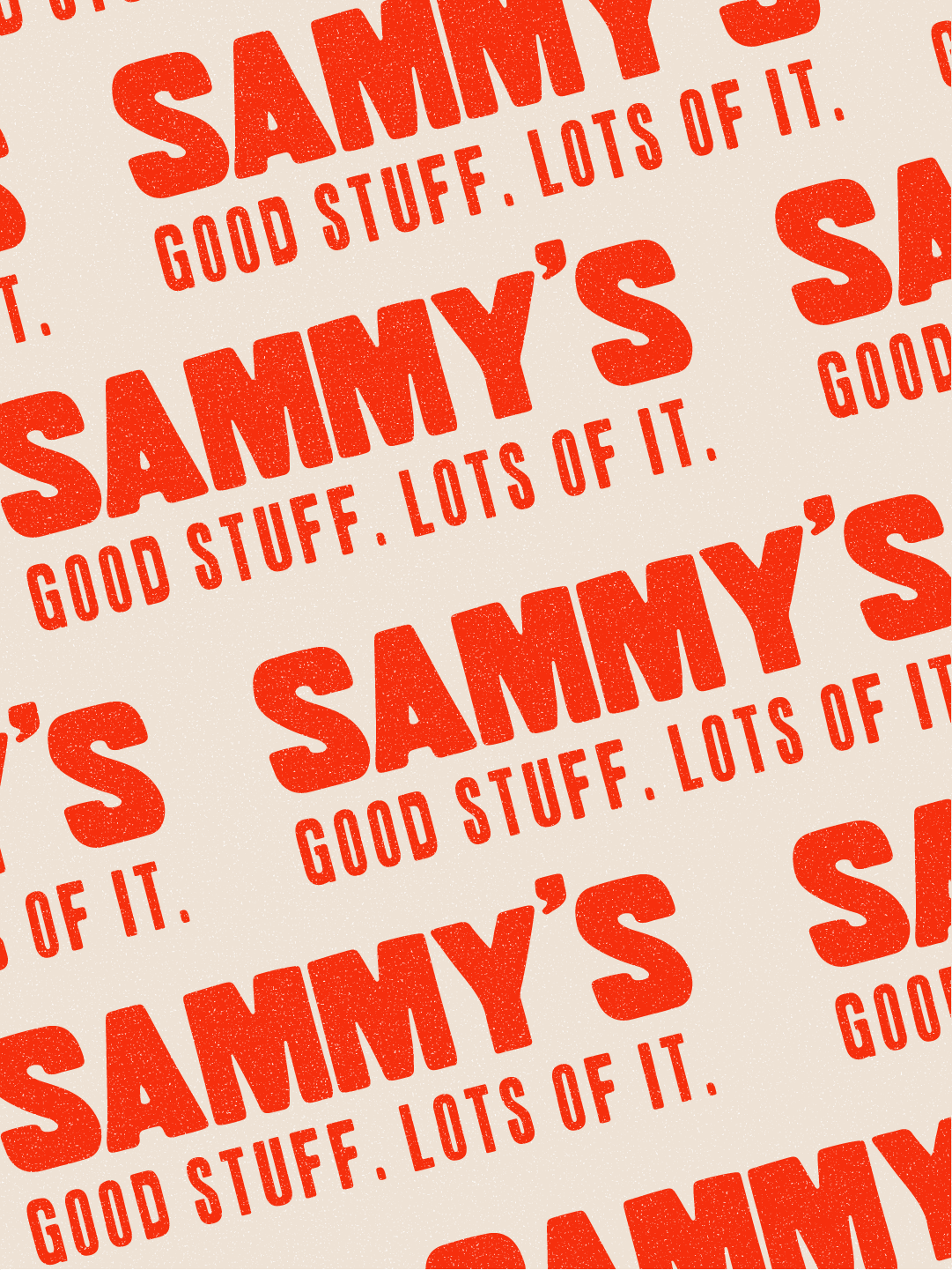
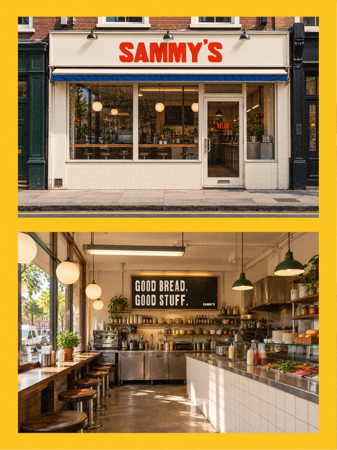
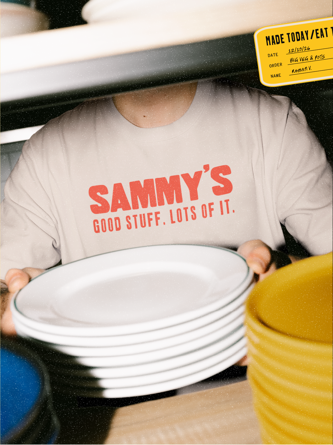
The identity was explored across menus, takeaway packaging, greaseproof paper, shopfront concepts, merchandise and social media.
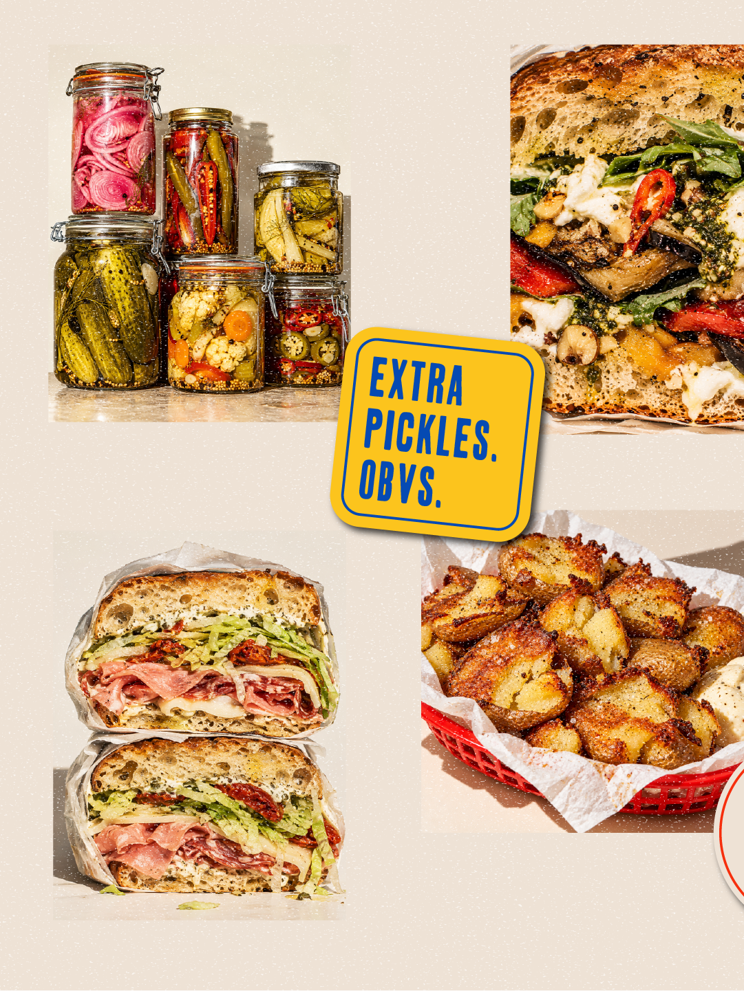
Large-scale typography and repeated wordmarks create recognisable branded moments, while food photography keeps the focus firmly on the sandwiches.
Each application uses the same visual principles in different ways, giving Sammy's a consistent personality without making everything look identical.
04 / THE BRAND IN PRACTICE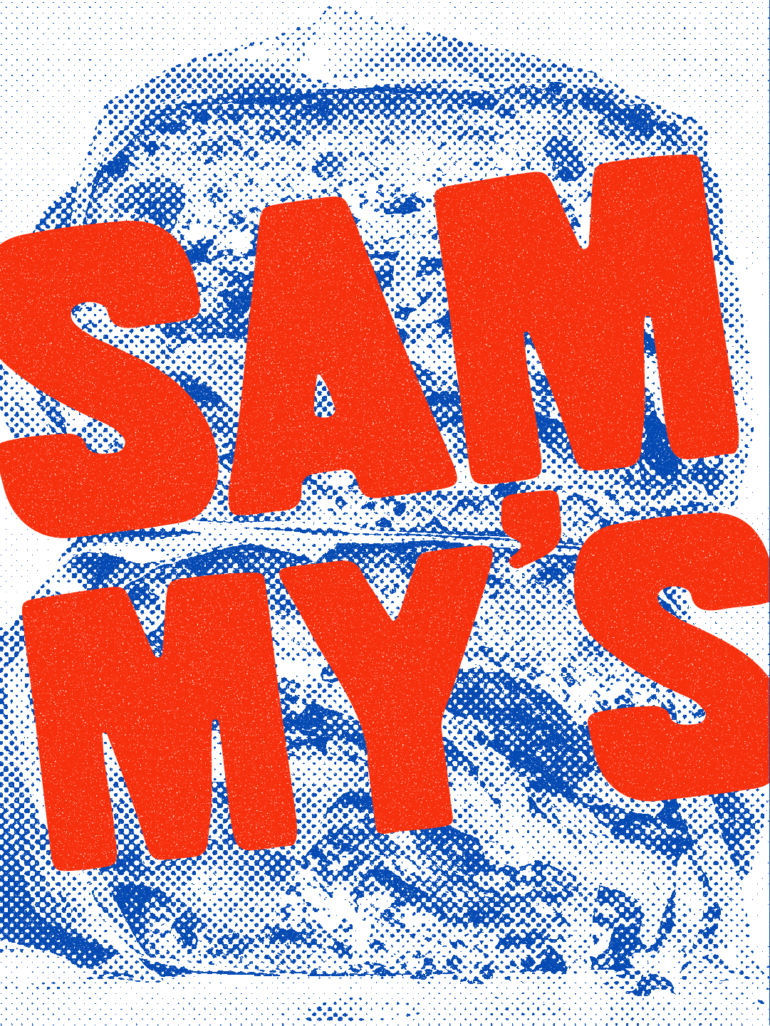
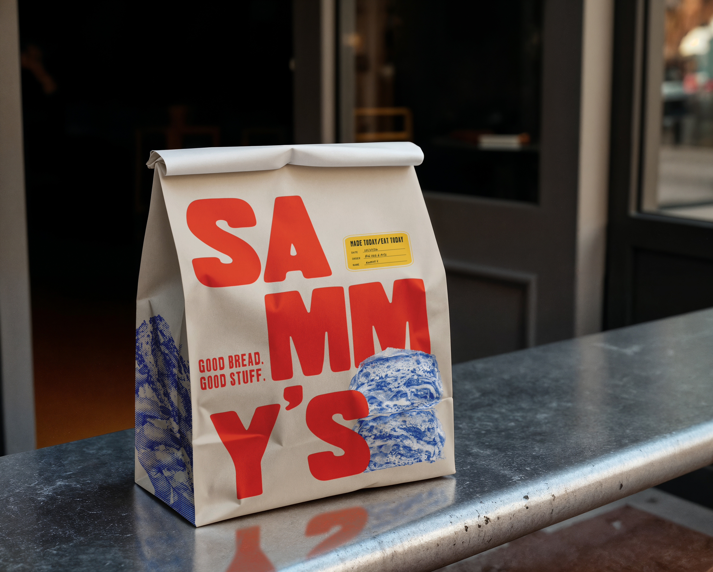
The finished concept is a cohesive identity with the familiarity of a neighbourhood favourite and the energy of a contemporary food brand.
Built around one clear idea, Sammy's shows how typography, colour, imagery and graphic details can work together to create a distinctive brand across multiple touchpoints.
05 / THE OUTCOME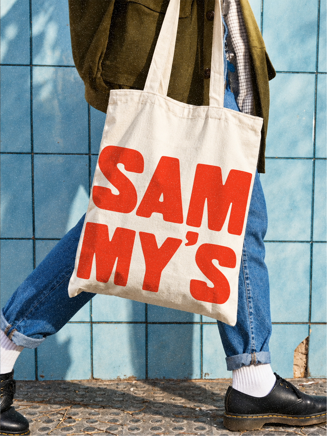
LET'S WORK TOGETHERYour brand could be next.
Got a project in mind? Whether you're starting from scratch, refreshing what you've got or looking for a little design support, I'd love to hear about it.