
OLURA
A vibrant, empowering identity for a women’s wellness brand - with packaging that pops and a strategy that speaks to every stage of life.
Service Performed
Mini Seedling
Year
2025
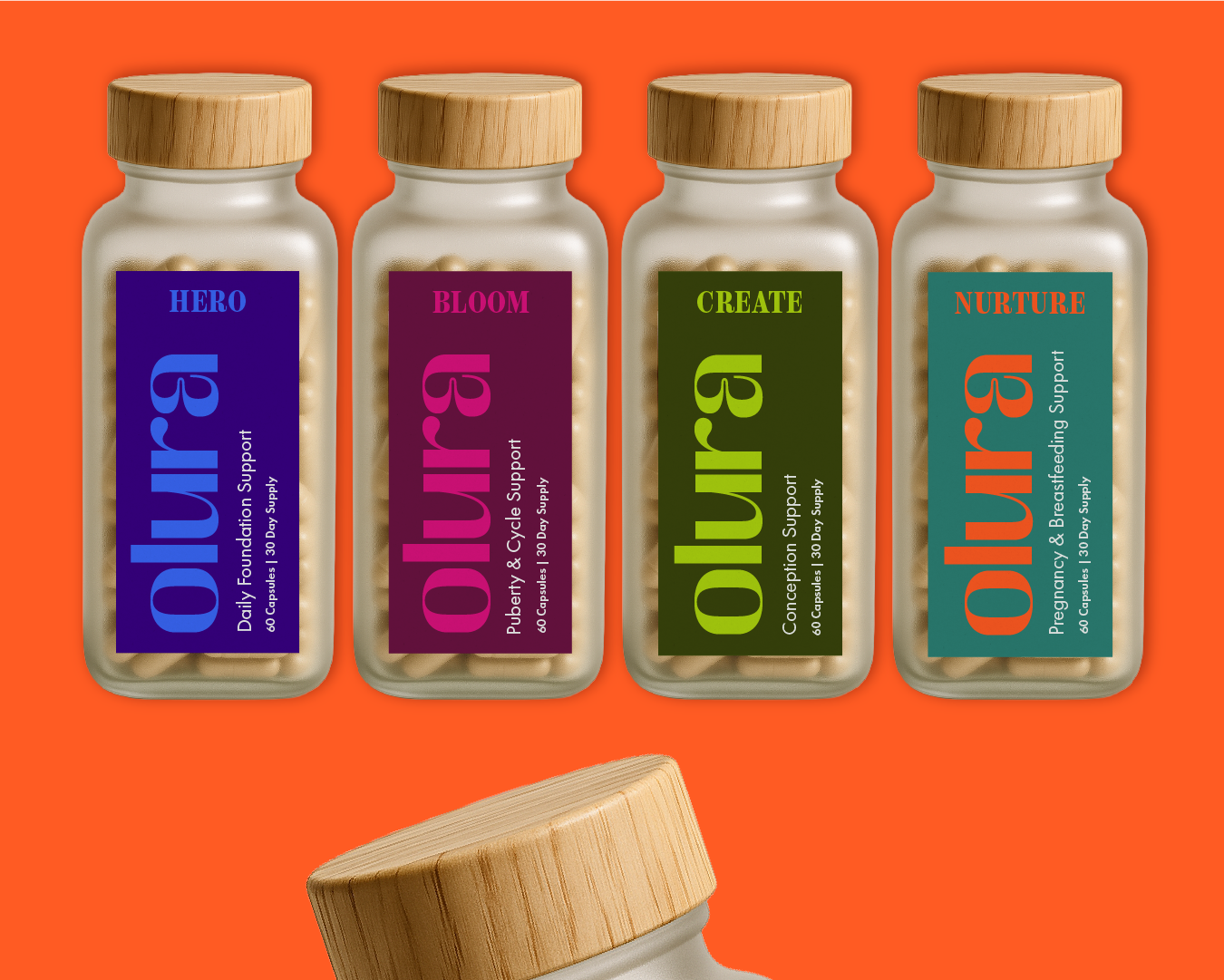
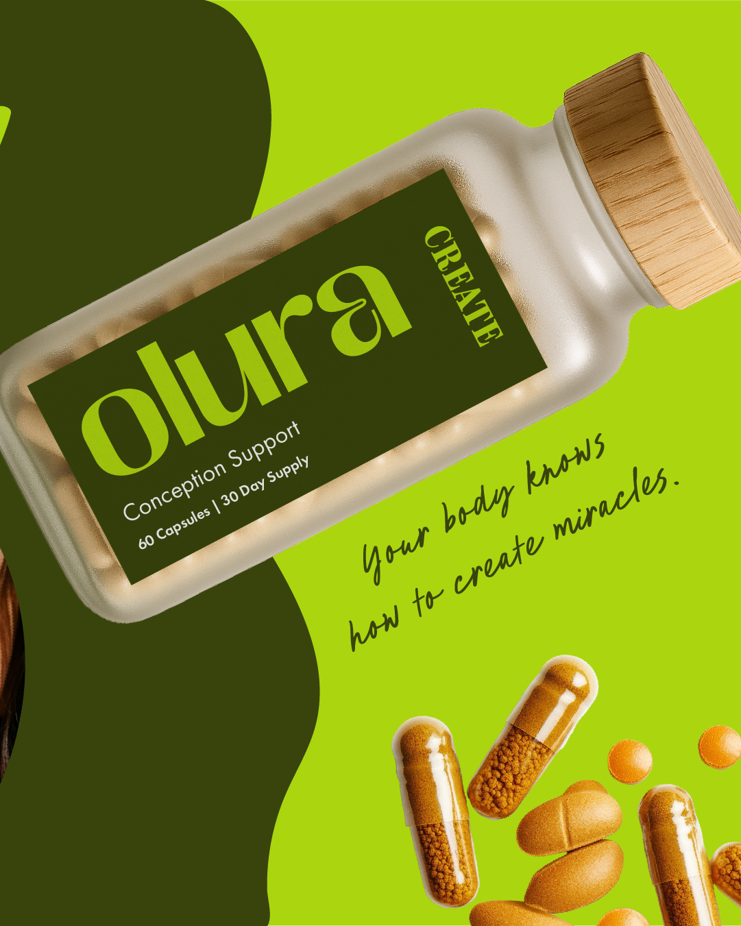
Olura is a wellness brand creating targeted, evidence-backed supplements designed to support women through every stage of life - from puberty to pregnancy and beyond. The brief was to create an identity that felt fresh, body-positive, and empowering - standing out from the sterile, clinical look of typical supplement brands.
THE STRATEGY
-
Olura’s audience are women who are proactive about their health and wellness but tired of being sold “quick fixes.” They want real, trustworthy products that respect their intelligence and celebrate their bodies - not shame them.
-
We positioned Olura as body confidence, bottled - a trusted partner through the ever-changing seasons of womanhood. The focus was on empowerment and support, rather than fear-based messaging.
-
Bold, joyful, and inclusive. The tone celebrates women’s strength and speaks with energy and clarity, turning what could feel like a medical decision into a moment of self-care.


THE VIBE.
We built a bright, unapologetic colour palette with a mix of jewel tones and energising brights to reflect vitality. The bold sans serif logotype is approachable yet confident, paired with playful handwritten accents to bring personality and movement. Photography is warm, diverse, and celebratory - showing real women, real moments, and real joy.
THE OUTCOME.
Olura’s bold new identity positions them as a standout in the wellness market. Their launch campaign drew immediate engagement, with their audience resonating strongly with the inclusive messaging and vibrant visuals — setting them up as a go-to brand for women’s wellness.