
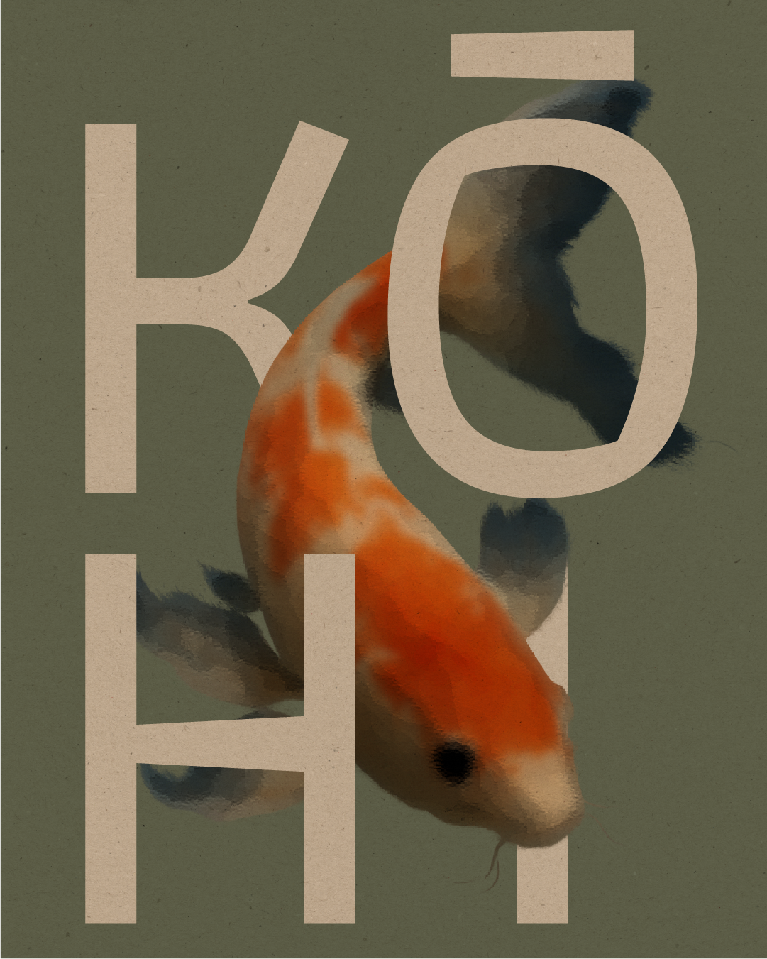
KOHI
A Japanese inspired minimal, refined brand for a specialty coffee spot - celebrating craftsmanship, ritual, and connection over a perfect pour.

Service Performed
Mini Seedling
Year
2025
Kōhī is a Japanese-inspired specialty coffee bar, designed to slow you down and bring mindfulness to every sip. The brand needed an identity that felt considered and calming — a visual sanctuary where coffee lovers could pause, connect, and savour the moment.
THE STRATEGY
-
Kōhī’s audience is made up of coffee enthusiasts, creatives, and mindful city dwellers looking for a quiet escape from the hustle — a place where quality and ritual matter.
-
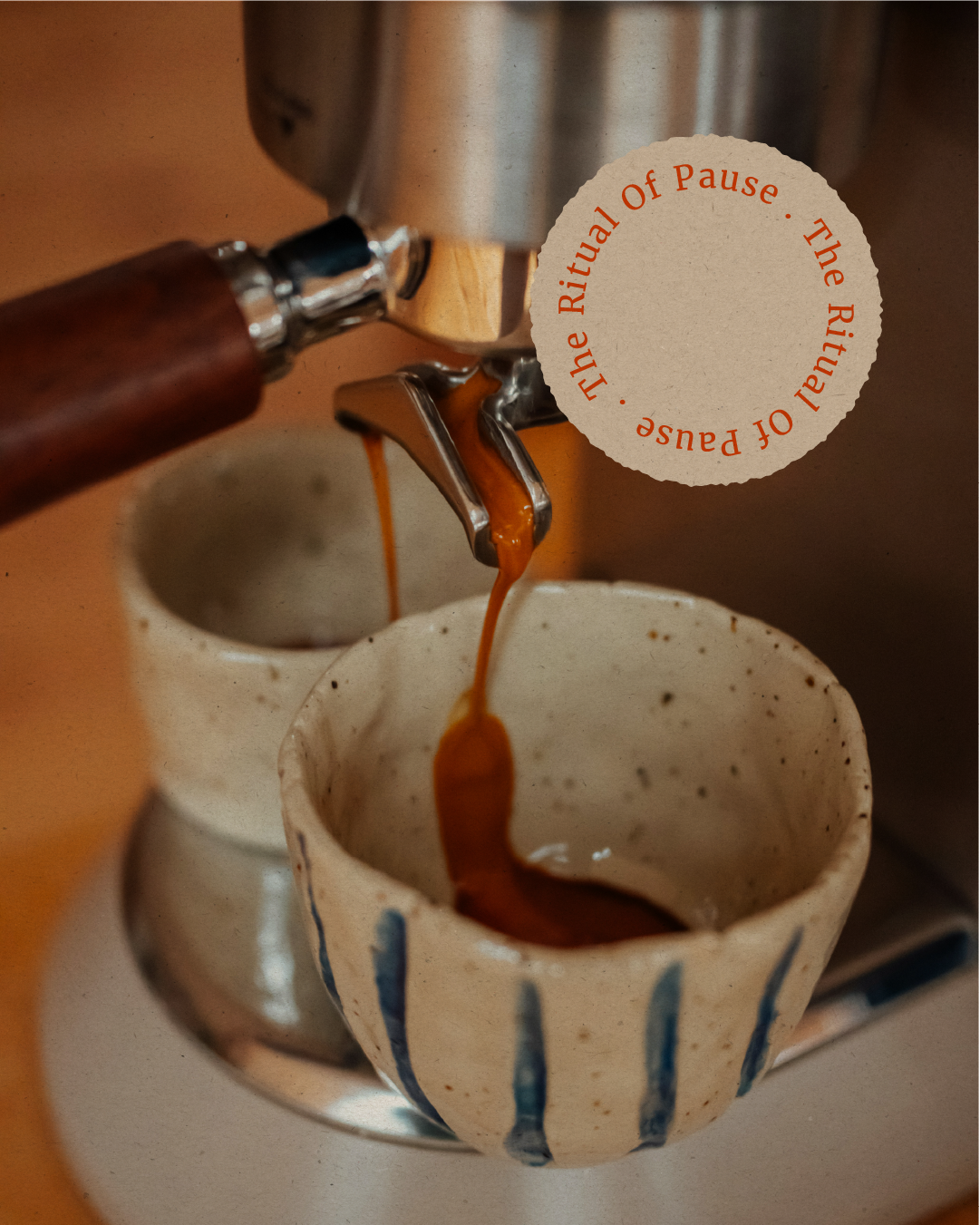
Kōhī is positioned as a tranquil, intentional coffee experience. Every detail — from the interiors to the typography — reinforces the brand’s ethos of slowing down and enjoying coffee as an art form.
-
Measured, warm, and poetic. Messaging is about inviting customers to step into a moment of calm, to “sip slowly” and reconnect with themselves.


THE VIBE.
The visual identity combines elegant, minimalist typography with earthy olive greens and natural textures. The koi fish illustrations introduce a fluid, grounding element, symbolising peace and balance. The overall aesthetic is pared-back yet memorable, evoking a sense of harmony and ritual.
THE OUTCOME.
Kōhī’s new identity has elevated the café experience into something more than just a coffee stop — it’s now a place people actively seek out for its serene atmosphere and thoughtful design. The brand’s cohesive aesthetic makes every touchpoint feel curated and intentional.