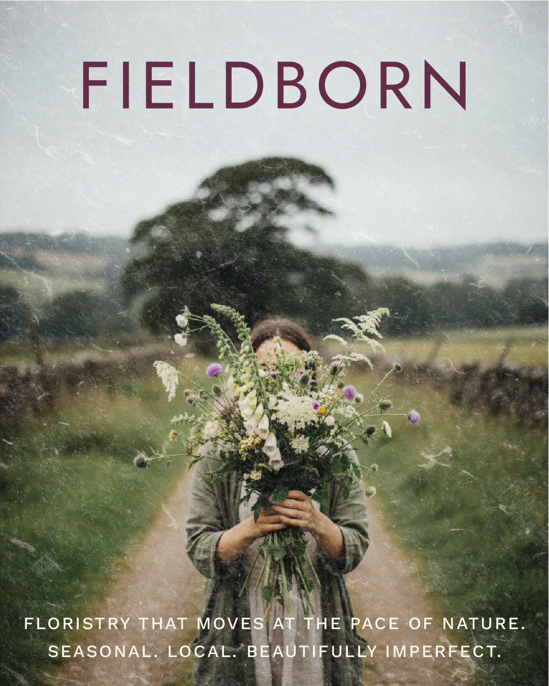
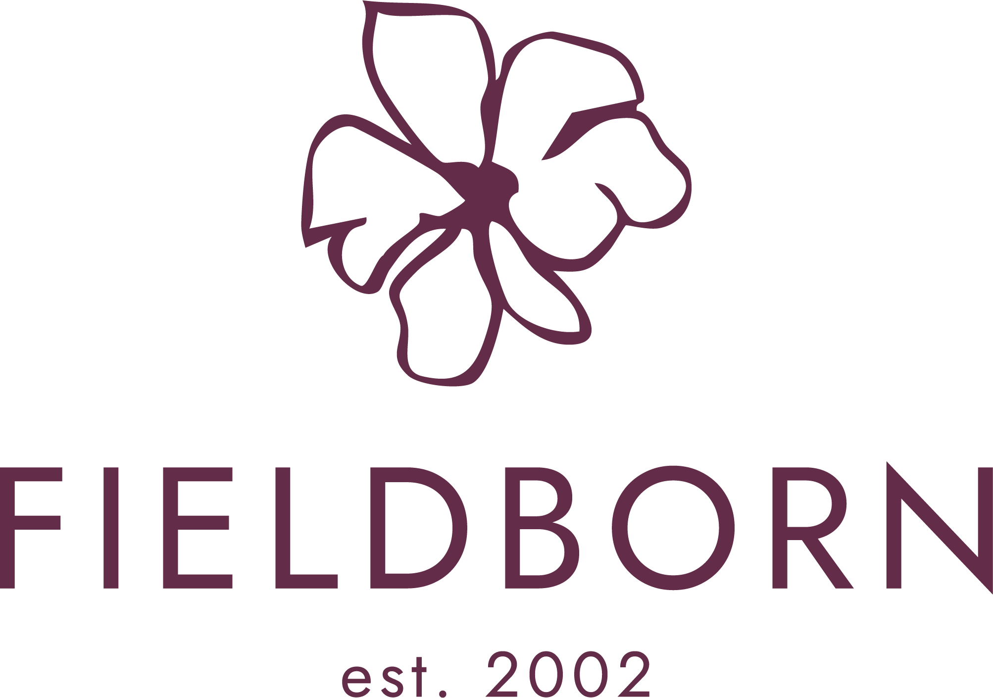
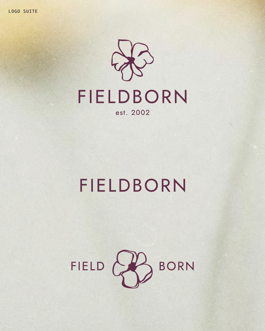
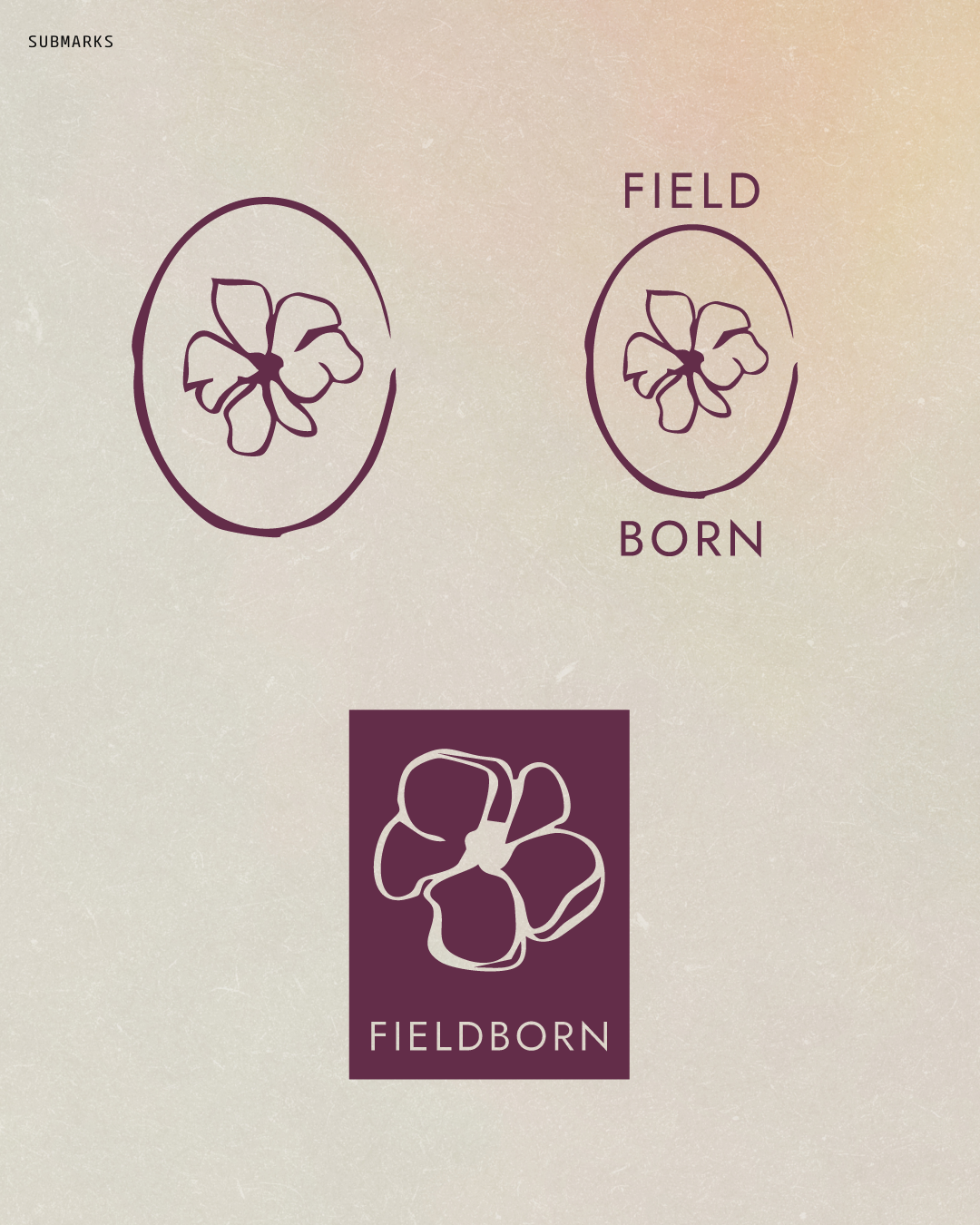
Fieldborn
Foundations + Photography + Socials + Website + Merch
2025
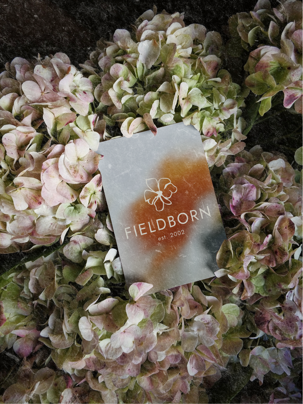
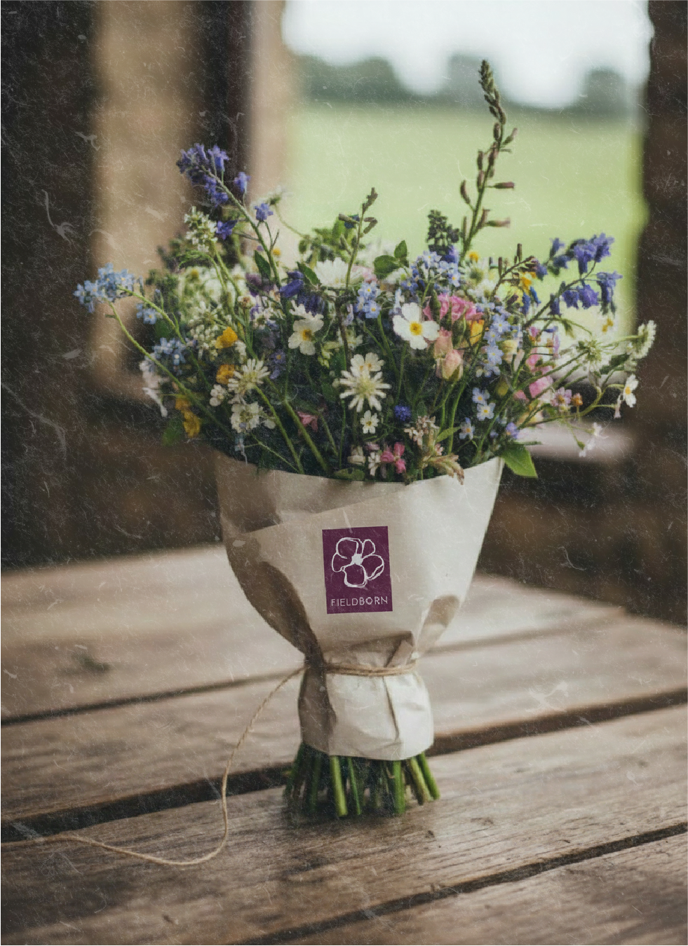
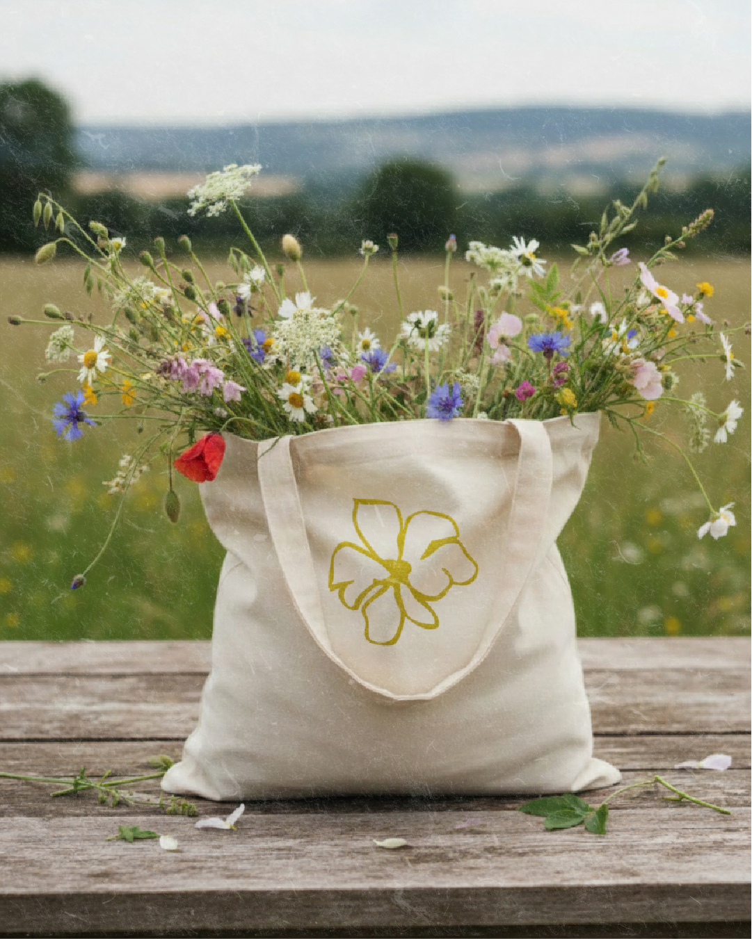
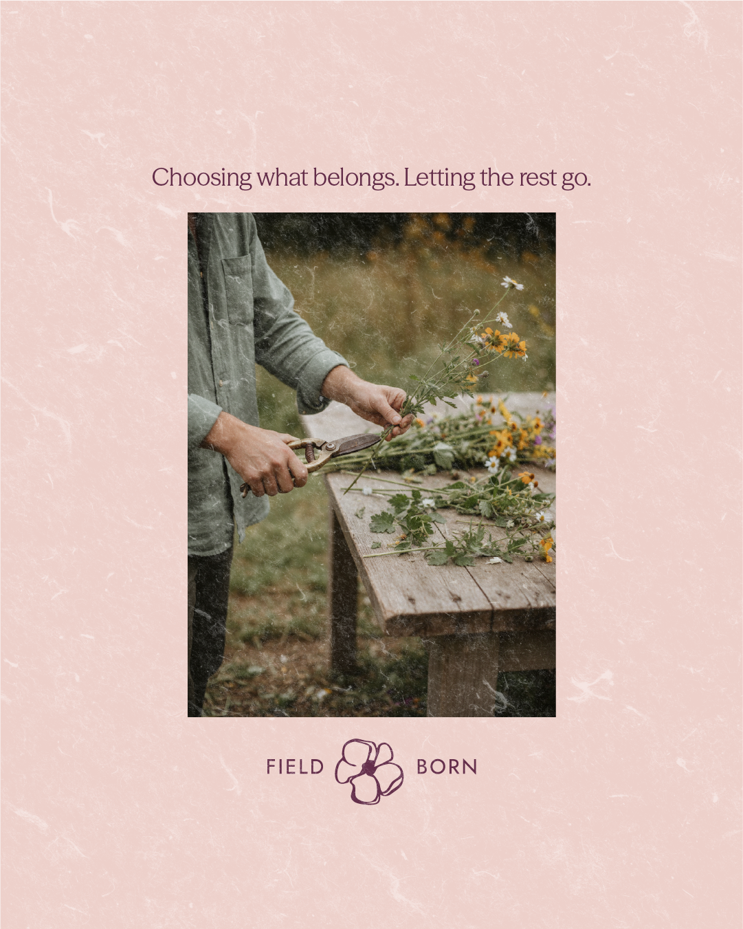
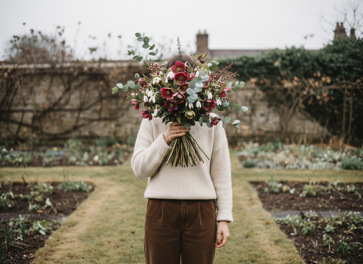
Fieldborn is a British-grown florist concept shaped by seasonality, locality, and intentional craft. The brand needed to feel rooted and steady — warm, editorial, and deeply connected to the land it comes from..
Many floral brands rely on imported stems and trend-led styling.
They look beautiful, but often feel detached from place. Fieldborn needed a brand that felt grounded, local, and quietly intentional.
( THE PROBLEM )( SEASON LED )
( LOCALLY GROWN )
( ROOTED IN PLACE )
( SUSTAINABLE )
( INTENTIONAL CRAFT )
( HONEST BEAUTY )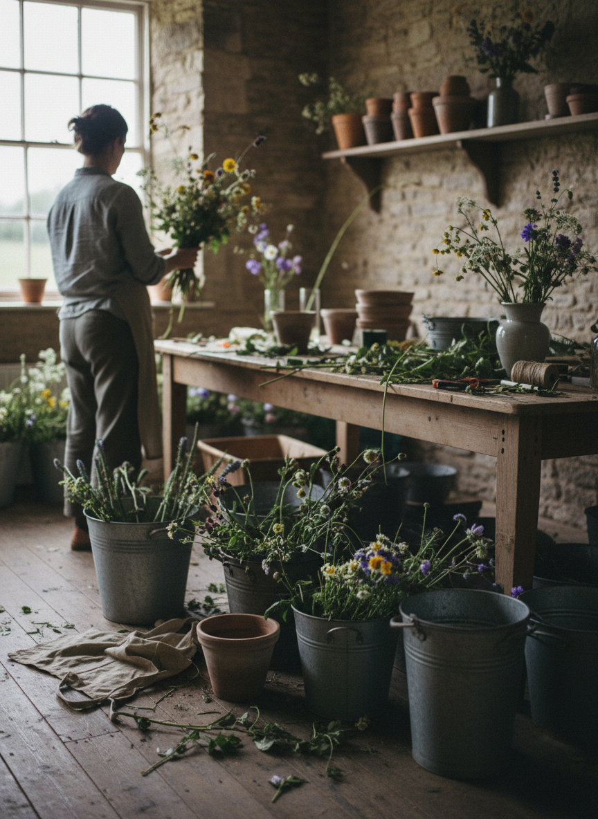
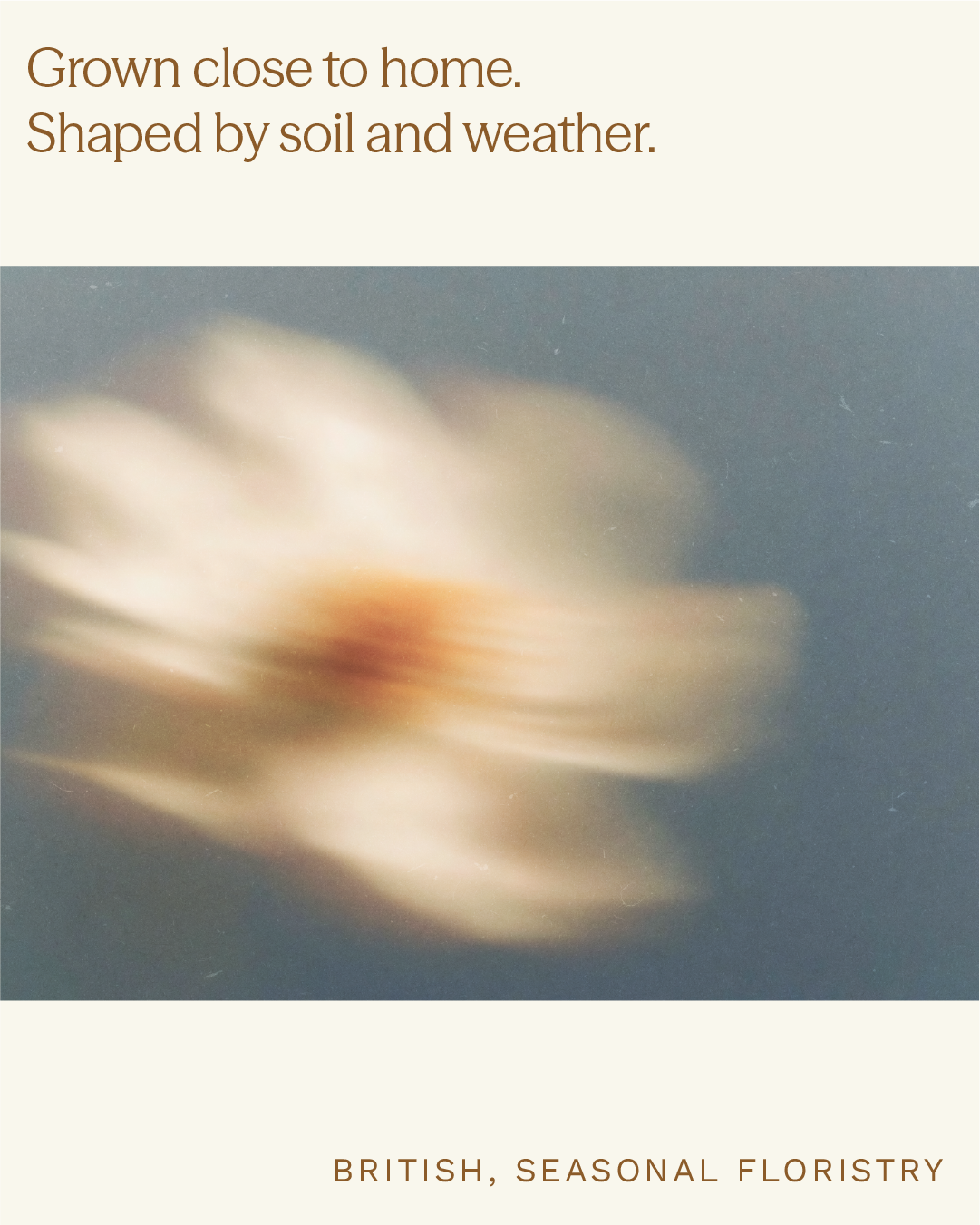
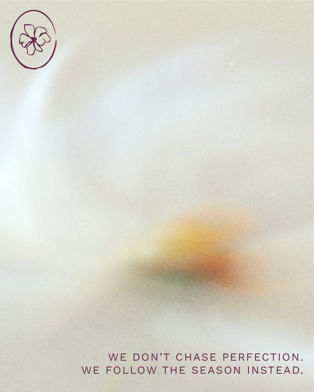
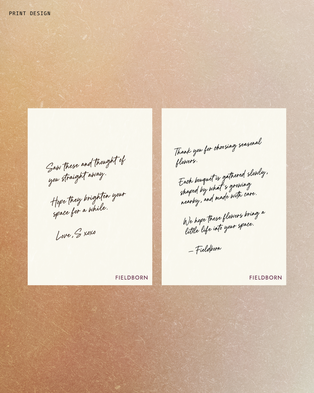
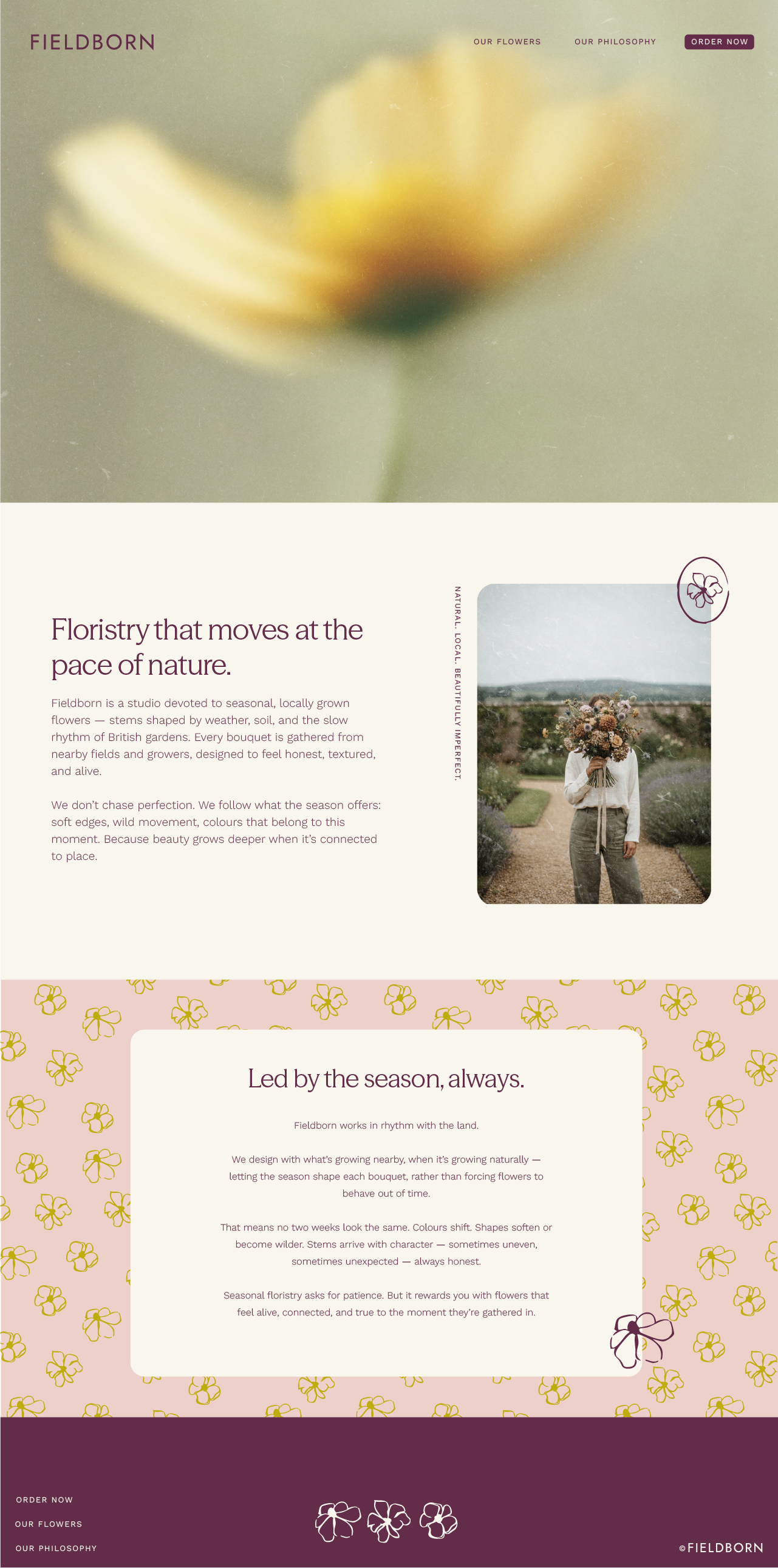
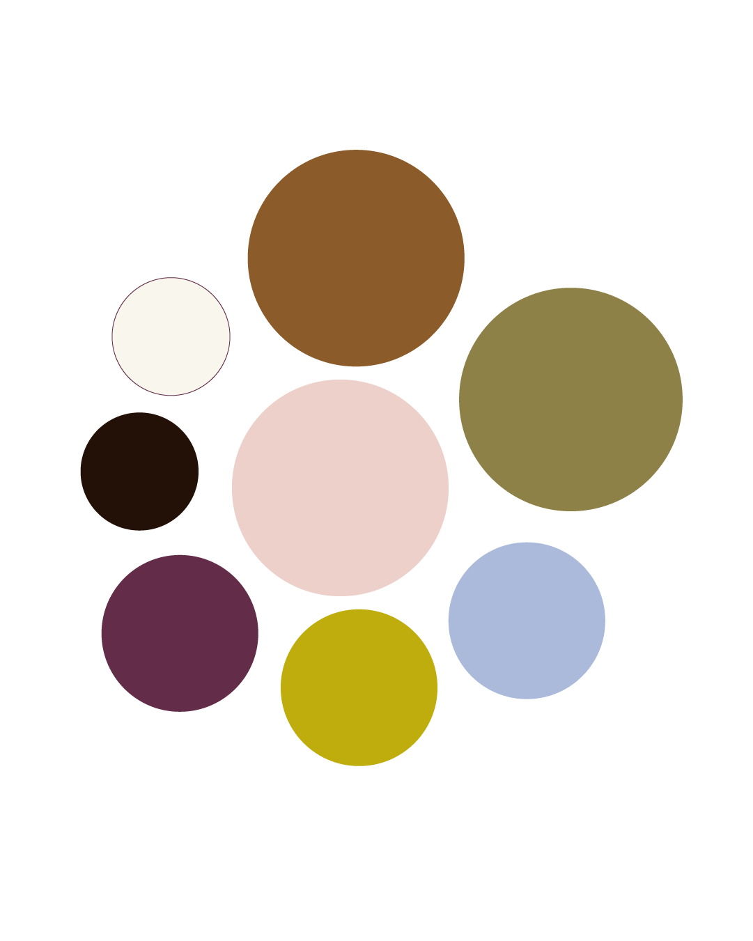
We built the identity around season-led colour, natural materials, and editorial typography — creating a visual language that feels grounded, calm, and shaped by the land.
( THE APPROACH )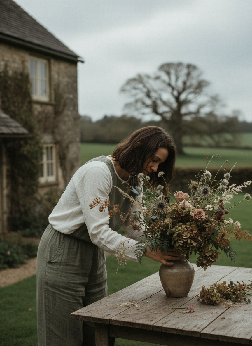
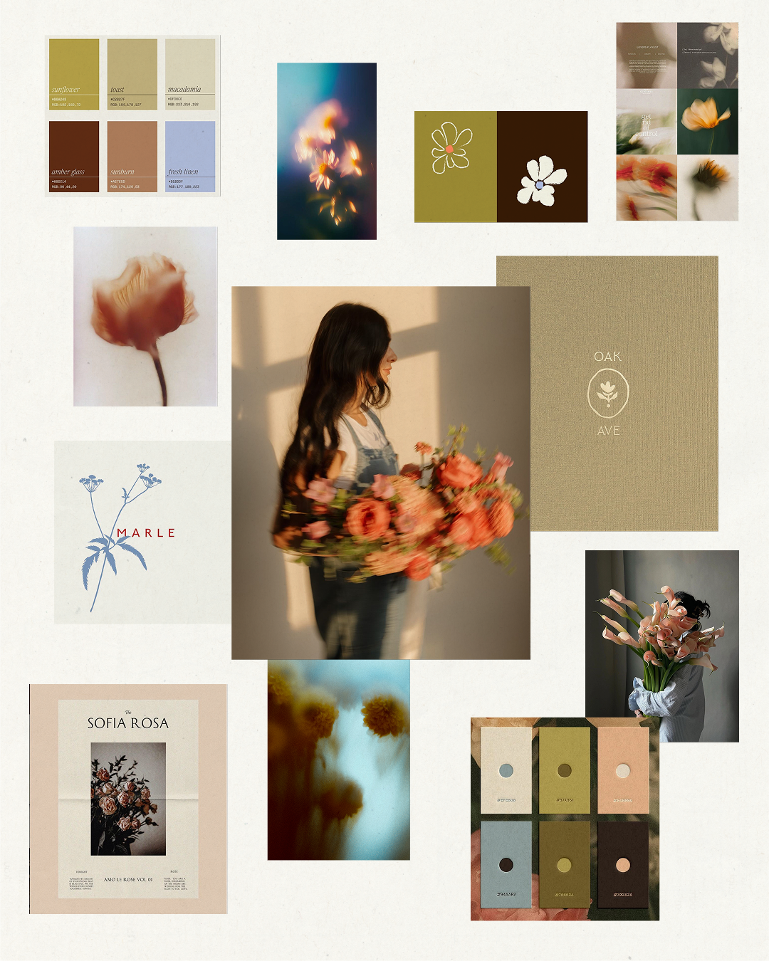
( THE IDENTITY )A calm, expressive identity rooted in place, the land and creative expression.

( THE SYSTEM )Earthy colour, quiet texture, and editorial type come together to form a calm, unified brand world.

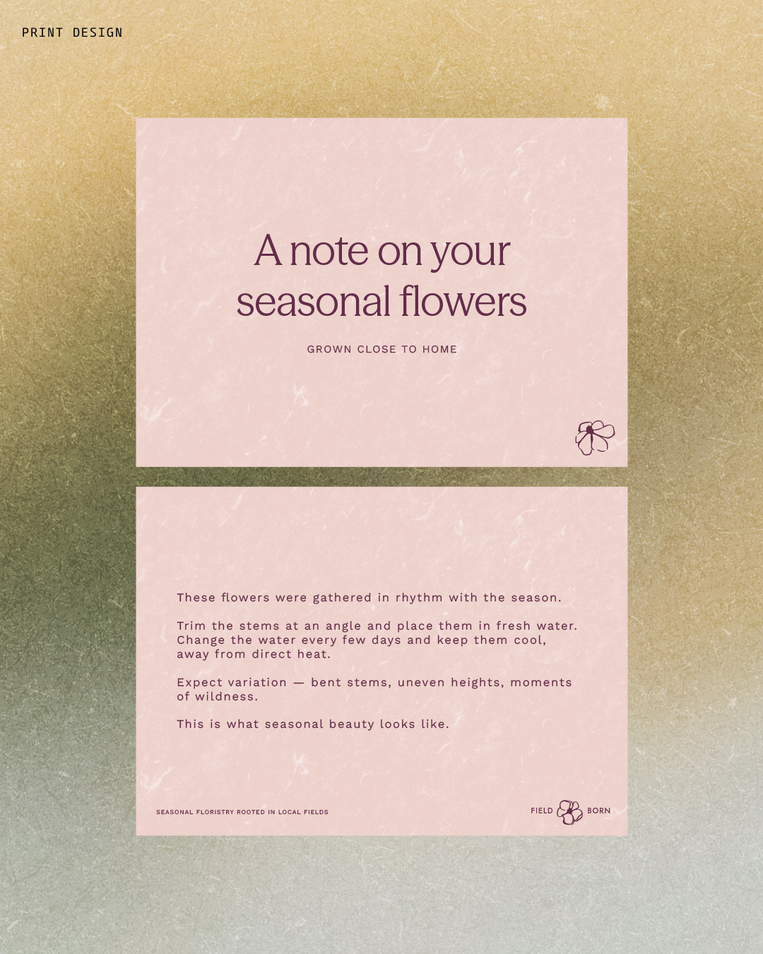
( THE OUTCOME )A grounded, intentional brand world expressed across print, digital, and packaging.