
FERN & FLORA
A botanical brand refresh full of warmth and calm - designed to make every customer feel at home, whether they’re picking a plant or sipping a latte.

Service Performed
Mini Seedling
Year
2025
A welcoming, editorial-inspired brand identity for a boutique plant store and café that blends greenery with soulful care.
The goal was to create a space where customers feel grounded, inspired, and connected - both in-store and online.
THE STRATEGY
-
Fern & Flora’s audience are plant lovers, café dwellers, and weekend wanderers looking for a calm space to recharge. They value sustainability, community, and the little rituals that make life feel special.
-
We positioned Fern & Flora as more than a shop - it’s a lifestyle destination where people can slow down, learn about plant care, and savour a great coffee.
-
Warm, poetic, and inviting. The voice encourages curiosity and makes customers feel like part of a community - equal parts friendly guide and gentle inspiration.


THE VIBE.
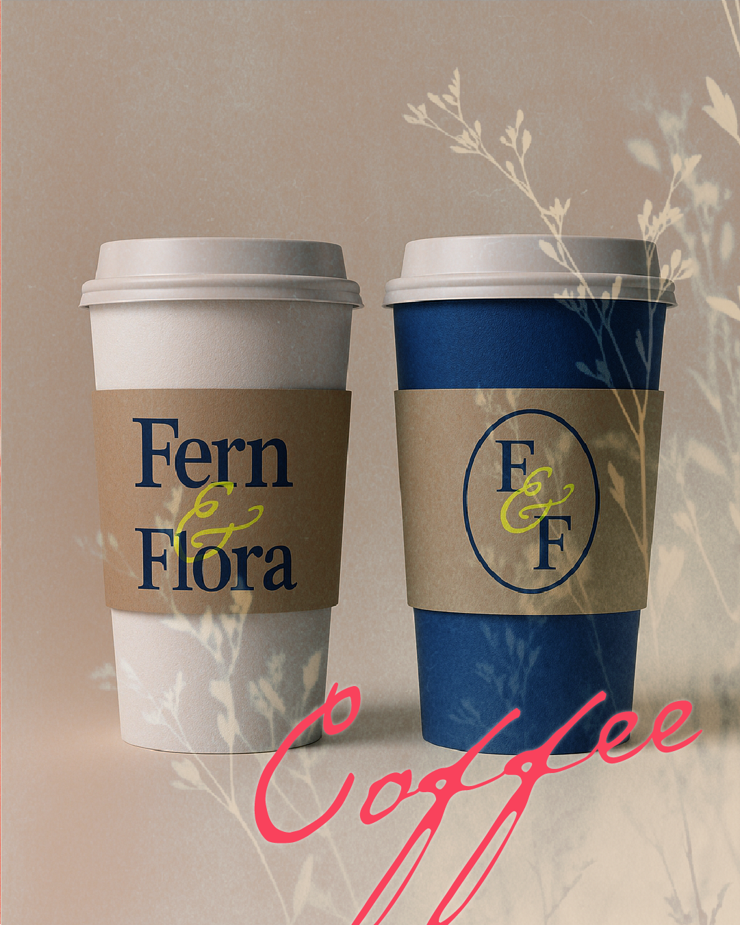
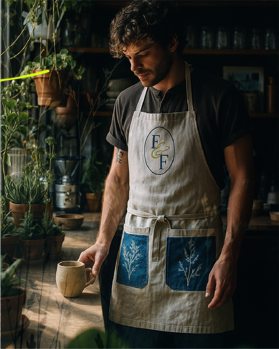
We paired a strong, elegant serif with delicate, botanical script accents for a “whimsical editorial” feel. The earthy-yet-bold colour palette (neons, deep navy, warm neutrals) mirrors the textures of the store itself. Cyanotype pressed-flower illustrations and grainy textures add depth and make the brand feel tactile and organic.
THE OUTCOME.
Fern & Flora now feels like the destination it was always meant to be. The refreshed identity draws in the right crowd - plant parents and coffee lovers — and invites them to linger, shop, and connect.