
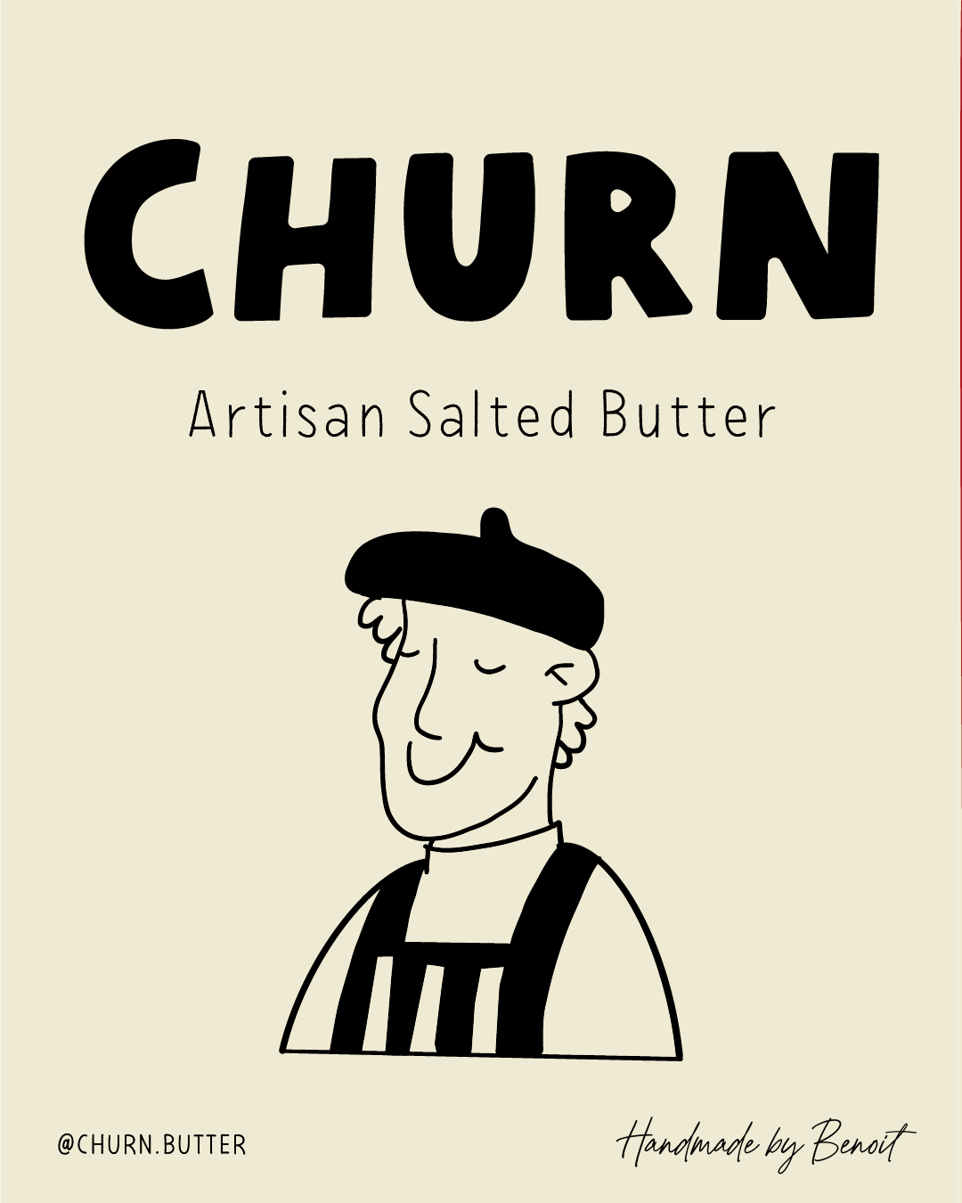
CHURN ARTISAN BUTTER

A charming, nostalgic brand for small-batch artisan butter - playful, handcrafted, and full of character.
Service Performed
Mini Seedling
Year
2025
A whimsical, hand-crafted brand identity for a small-batch butter business that celebrates slow living, tradition, and the joy of truly great butter.
The founders wanted something that felt nostalgic and full of character - a brand that would instantly communicate “made by hand” and stand out on shelves with personality and warmth.
THE STRATEGY
-
Churn’s ideal customers are food lovers who value quality, craft, and authenticity. They’re the type who visit farmers markets, read ingredient labels, and will happily pay more for something made with care.
-
We positioned Churn as a love letter to artisanal butter - a brand that celebrates slow processes, timeless recipes, and the small joys of everyday rituals.
-
Playful, warm, and just a little bit cheeky. The tone mixes French-country charm with a wink of humour - making the brand feel approachable and memorable.


THE VIBE.
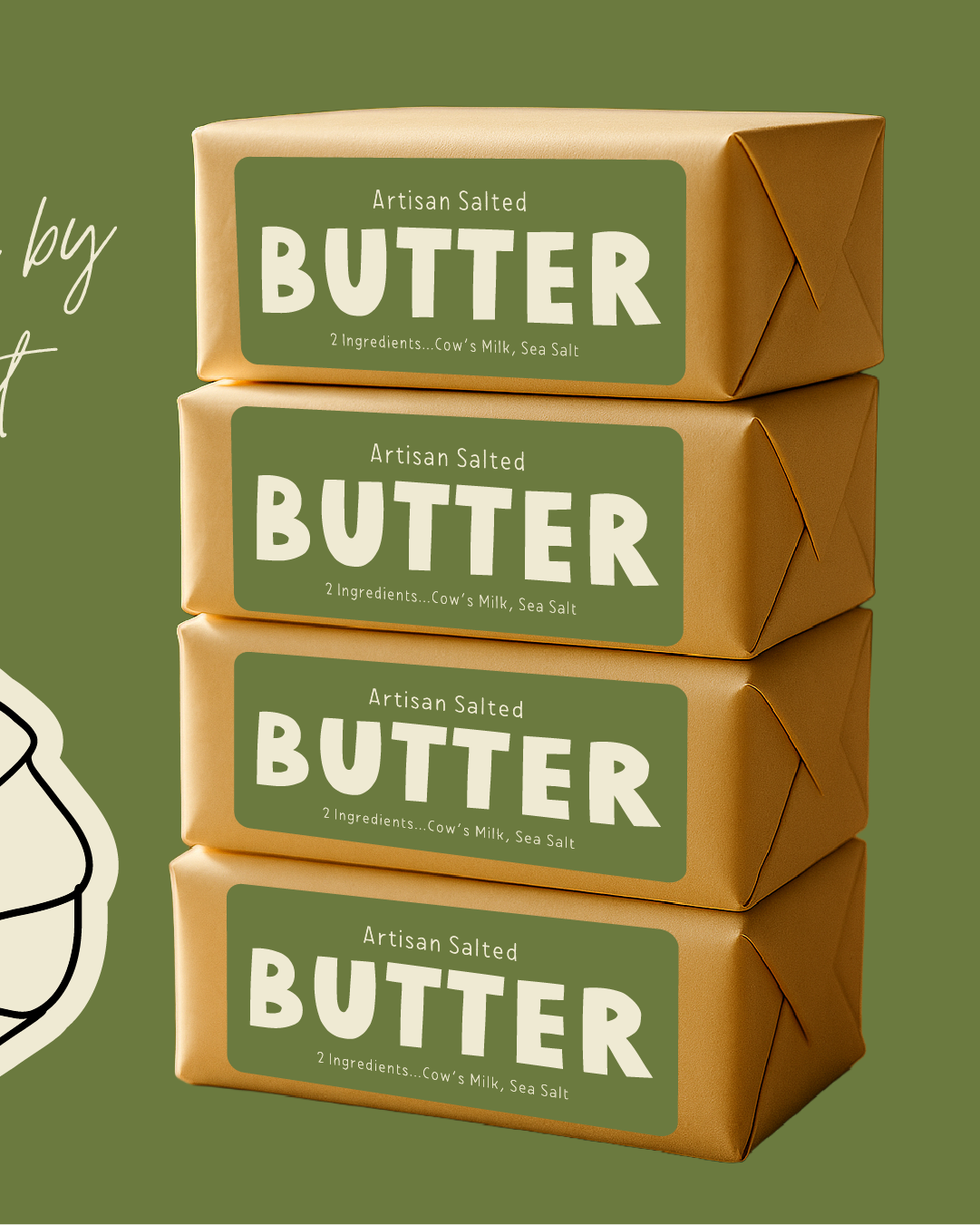
Hand-drawn illustrations of bakers, cows, and butter blocks bring Churn’s story to life. The colour palette of creamy neutrals, buttery yellows, rustic greens, and bold reds creates a nostalgic yet fresh look. The typography feels tactile and slightly imperfect — reinforcing the handmade, small-batch quality.
THE OUTCOME.
Churn’s new identity now perfectly captures the spirit of its product - customers can feel the craft and care before they even take a bite. Early testers have shared that the branding makes them smile and that they’d pick it up off the shelf for its charm alone.