
Chrissie Chung Yoga
Origin + Socials + Website + Merch
2025
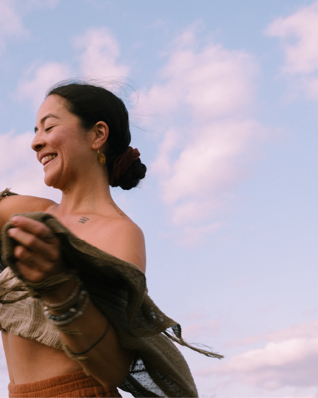
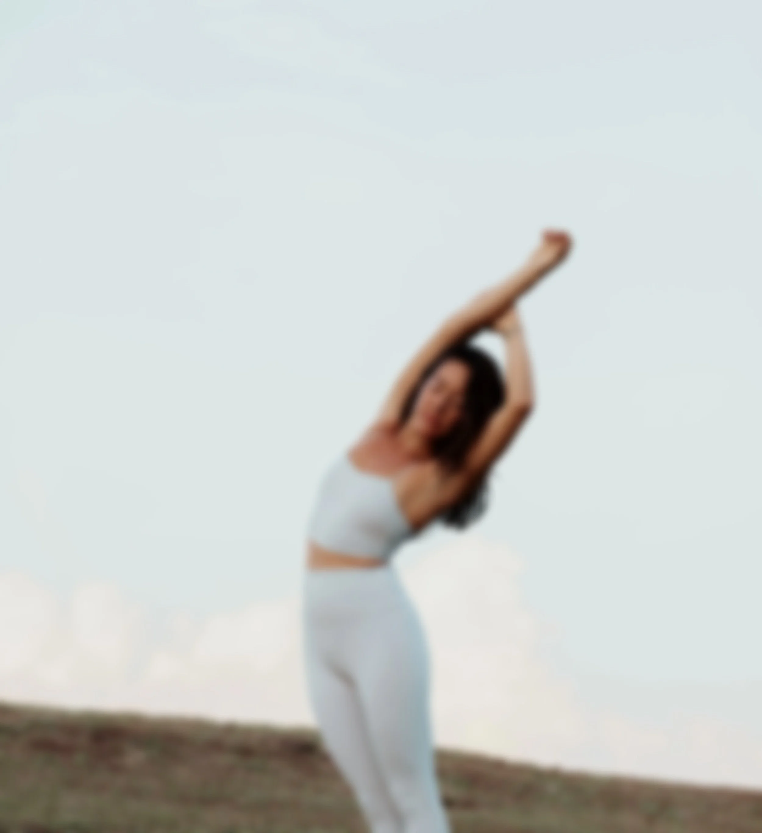
Chrissie is a yoga teacher whose practice centres on intentional movement, grounding, and self-connection. She needed a visual identity that felt warm, real, and rooted in nature — something soft, steady, and deeply human.
Chrissie’s existing identity didn’t reflect the warmth and depth of her teaching — it felt generic and lacked emotion. She needed a brand that felt grounded and personal, not performative.
( THE PROBLEM )( warmth )
( AUTHENTICity )
( INCLUSIVity )
( empowerment )
( balance )
( connection )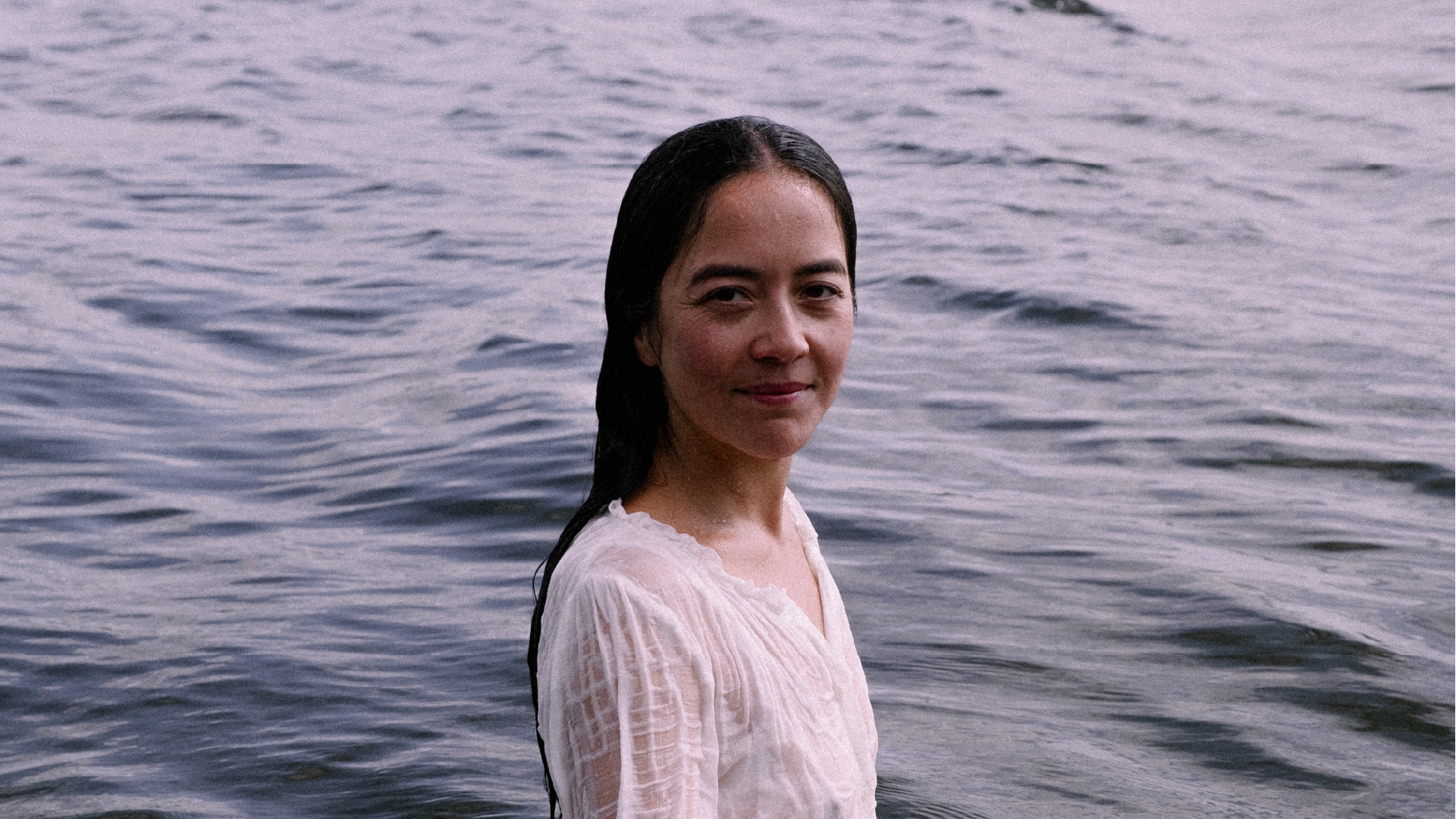
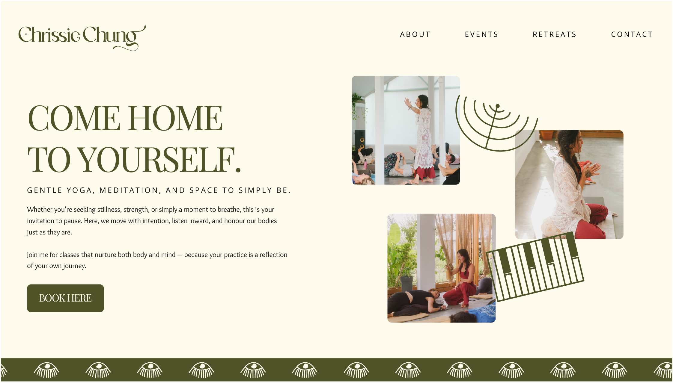
We built the identity around earthy tones, quiet textures, and soft forms — creating a visual language that feels calm, tactile, and connected to nature.
( THE APPROACH )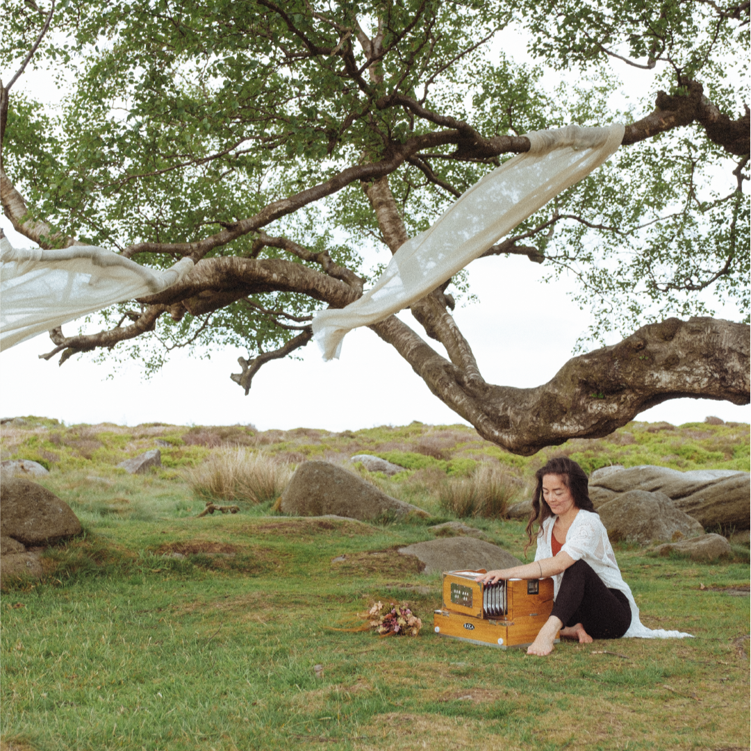
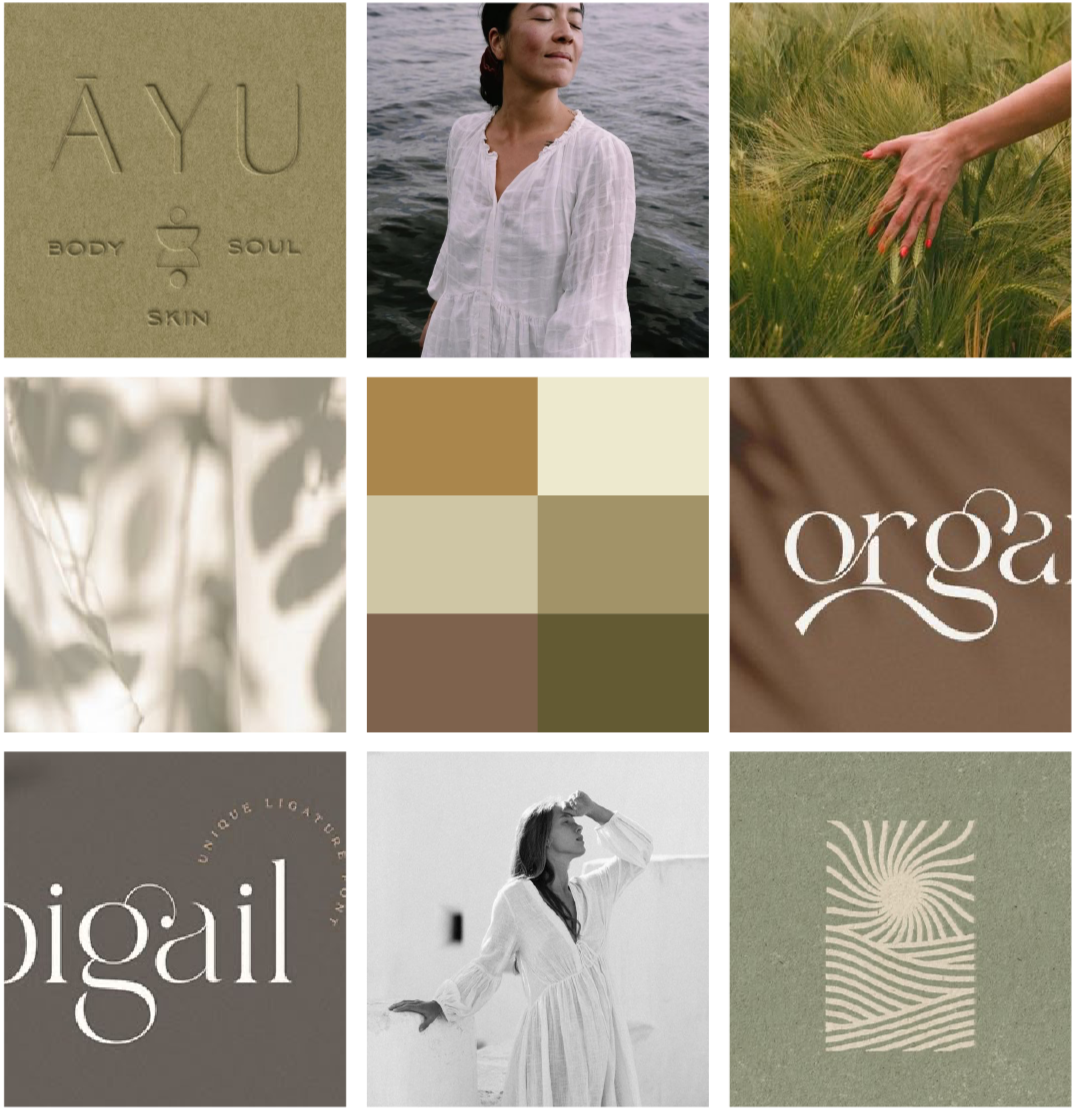
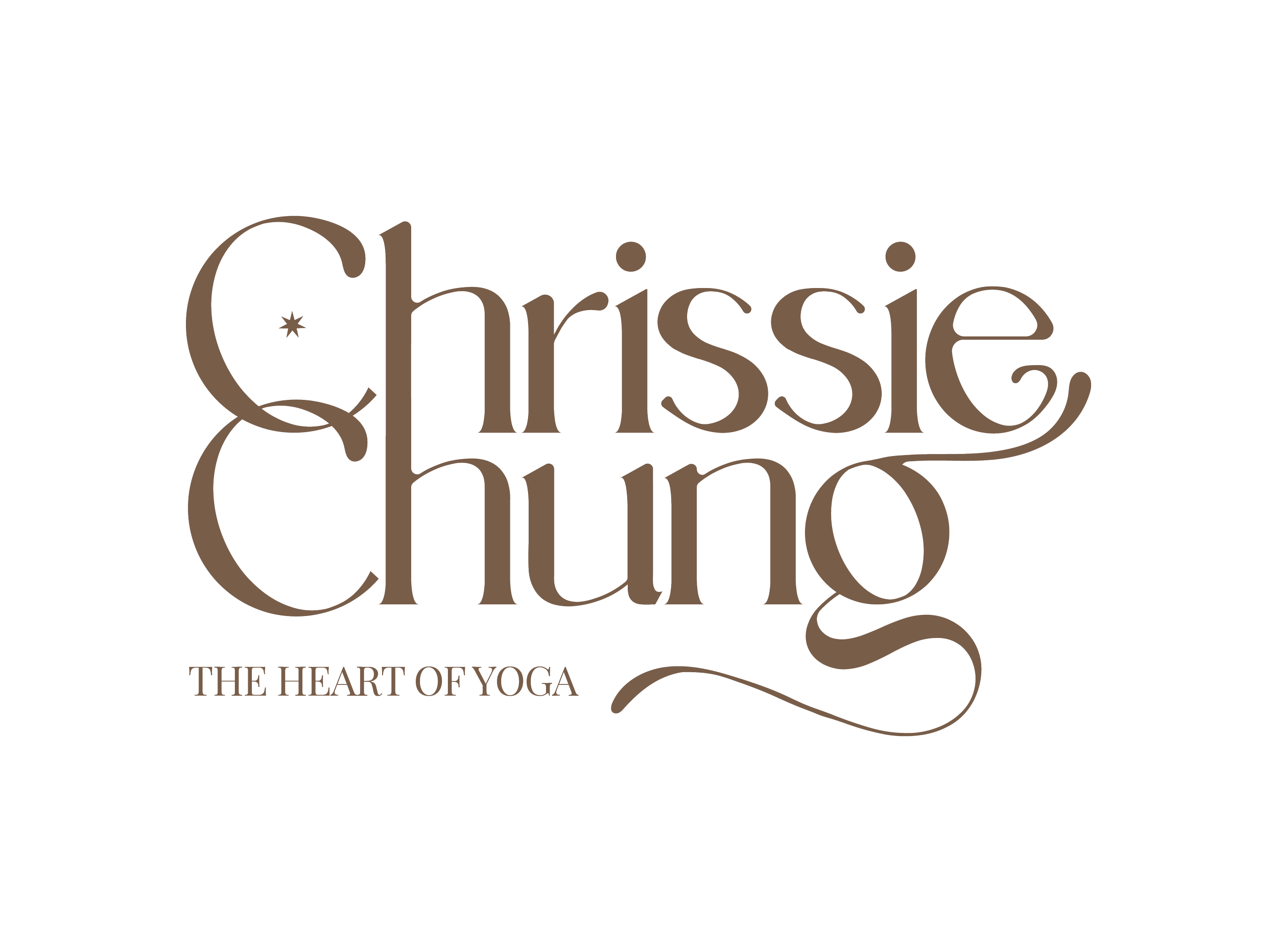
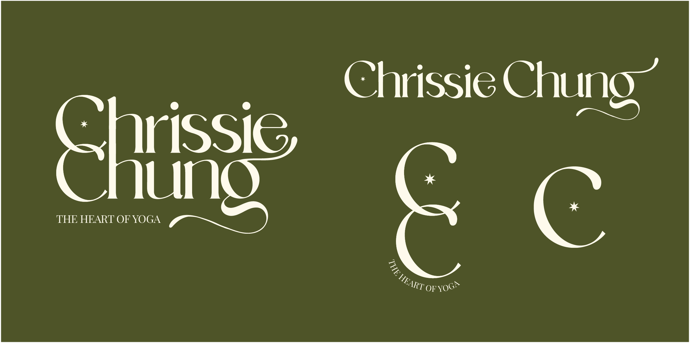
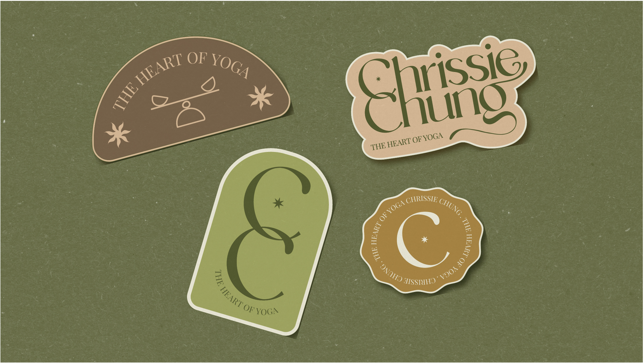
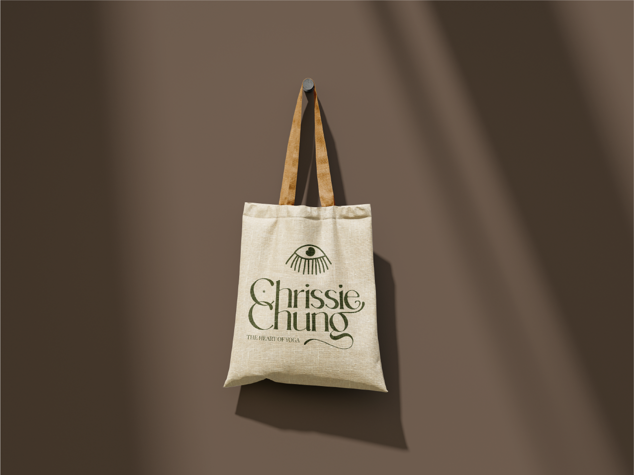
( THE IDENTITY )A calm, expressive logotype shaped by breath and fluid movement.
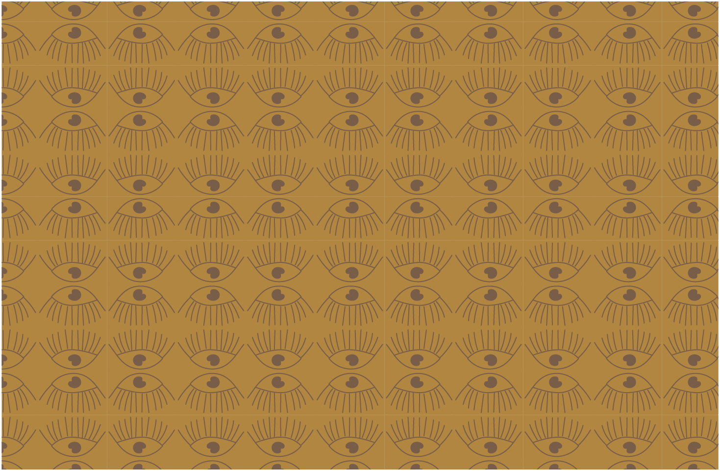
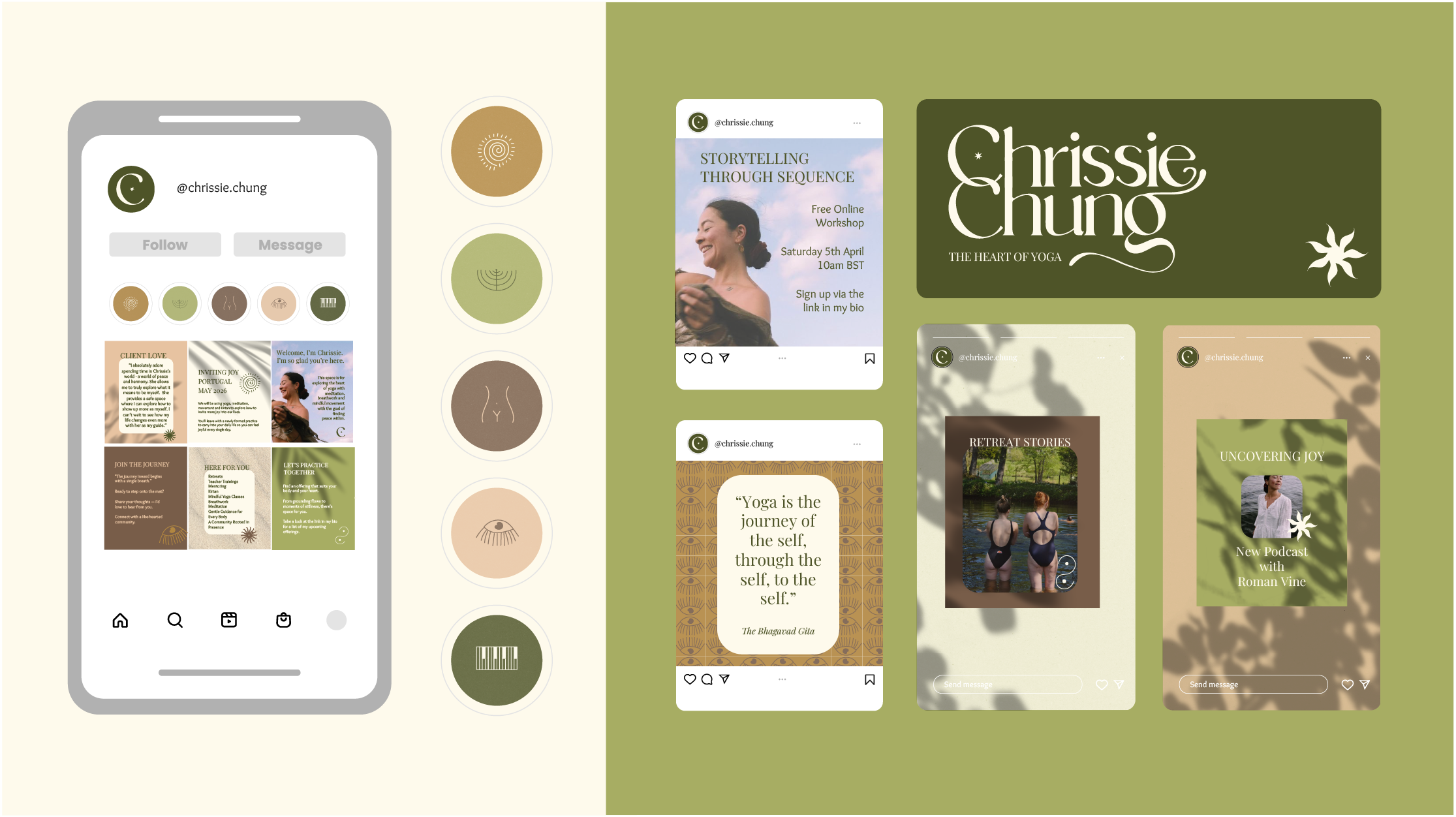
( THE SYSTEM )Earthy tones, organic patterns, and soft forms create a unified brand world.

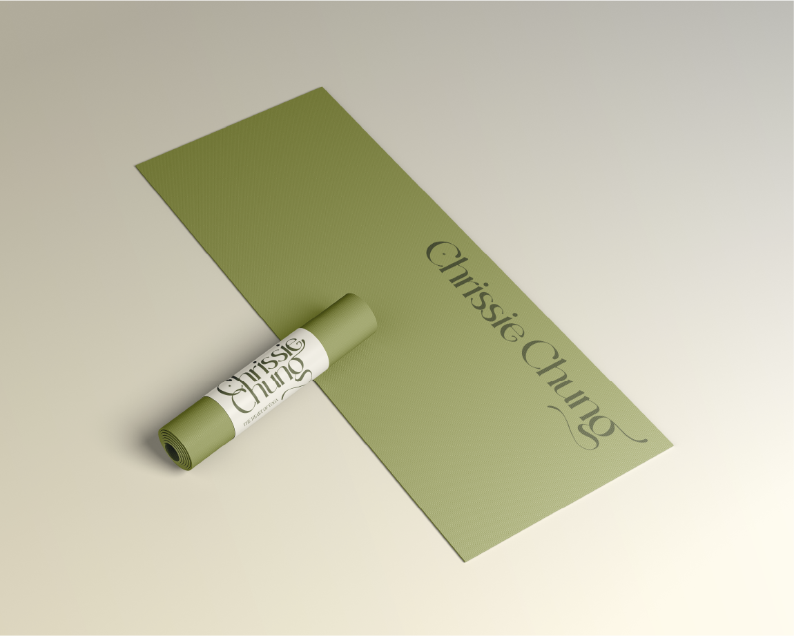
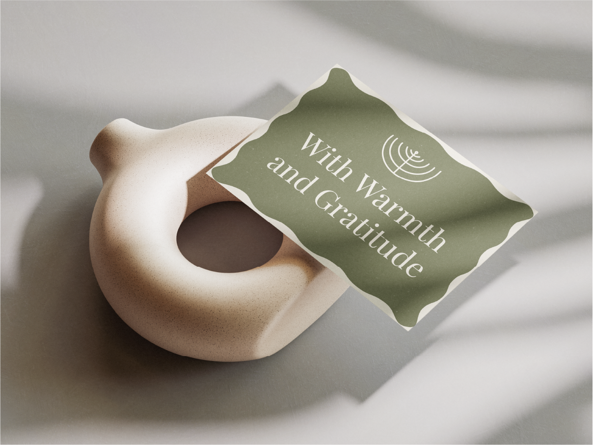
( THE OUTCOME )A grounded, soulful brand identity brought to life across print, digital, and merchandise.
“Working with Sara has been an utter delight. This isn’t just branding, it’s a conversation between two people, and her capacity to see and tune into the human in front of her is such a gift. She has a quality of listening & care that is hard to come by these days.”
( THE TESTIMONIAL )CHRISSIE CHUNG